Last updated: September 28, 2026
What Are the Four Golden Signals?
The four golden signals are latency, traffic, errors, and saturation. They come from Google's SRE book, and the claim is deliberately modest: if you can only instrument four things on a user-facing service, these four catch nearly every failure mode that actually matters.
They hold up because they measure the service from the outside, the way a user experiences it, not from the inside where you drown in host-level counters that tell you nothing about whether anyone's having a bad time. A box can be at 30% CPU and completely broken for users. The golden signals catch that. CPU utilization doesn't.
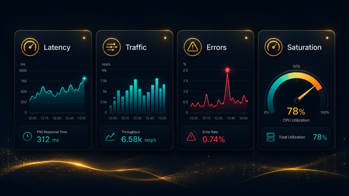
Signal 1: Latency
Latency is how long a request takes to serve. The thing that bites people: you have to separate successful latency from failed latency. A fast error is still an error, and if you fold failed requests into your latency numbers, a flood of instant 500s will make your dashboard look healthier than it is. Split them, or the signal actively misleads you during an outage.
Averages hide the pain too. A 50ms mean can still mean one in every hundred users waits three seconds. Use percentiles (p50, p95, p99) so you see the tail where real user frustration lives.
OpenTelemetry's auto-instrumentation emits http.server.request.duration as a histogram measured in seconds, with the request method, route, and response status code as attributes:
1234567# p95 server latency over the last 5 minutes, by routehistogram_quantile(0.95,sum by (le, http_route) (rate(http_server_request_duration_seconds_bucket[5m])))
Because http.response.status_code is already an attribute, you can filter to successful requests only and keep the signal honest. The histogram ships with sensible default bucket boundaries, so p95 and p99 are meaningful from the start rather than smeared across two enormous buckets.
Signal 2: Traffic
Traffic is demand: requests per second for an HTTP service, queries per second for a database, messages published per second or queue depth for a message broker, records per minute for a batch pipeline. The unit depends on what your service actually does.
Traffic is the odd one out because you rarely alert on it directly. High traffic is normally a good problem. Its job is context: a spike in errors during a traffic surge means something completely different from the same spike at 3 a.m. with flat traffic. Without traffic on the same graph, you're guessing.
The same OpenTelemetry histogram gives you traffic for free:
1234# Requests per second, by routesum by (http_route) (rate(http_server_request_duration_seconds_count[5m]))
Instrument latency and you get traffic in the same metric. That's not an accident. It's why request-duration histograms are the backbone of golden-signal monitoring.
Signal 3: Errors
Errors are the rate of requests that fail. "Fail" is broader than it looks, and the failures users notice most are often the ones monitoring misses:
- Explicit failures: HTTP 5xx, RPC errors, exceptions thrown back to the caller.
- Implicit failures: responses that return 200 with wrong or empty content. A search endpoint returning empty results because a backend silently timed out looks healthy to any status-code check.
- Policy failures: requests that technically succeeded but violated an SLO. If your target is 300ms and a request takes two seconds, that's an error even if it returned a 200.
Explicit errors are straightforward since the status code is already an attribute:
1234# Fraction of requests returning 5xx, over 5 minutessum(rate(http_server_request_duration_seconds_count{http_response_status_code=~"5.."}[5m]))/sum(rate(http_server_request_duration_seconds_count[5m]))
Express errors as a ratio, not a raw count. Fifty errors per second is a crisis for a service doing 100 requests per second and noise for one doing 100,000. Only the ratio maps to user pain, which is why you need the traffic signal right next to it.
Signal 4: Saturation
Saturation is how full your system is, measured against whatever resource runs out first. Often that's CPU, memory, disk, or network bandwidth. Just as often it's something less obvious: a connection pool, a thread pool, file descriptors, queue depth. The challenge is identifying the resource that will actually cap your service and watching that, not just the metrics that happen to be easy.
OpenTelemetry host metrics cover the infrastructure layer via system.cpu.utilization and system.memory.utilization. But the more useful saturation signals tend to be application-level. A connection pool at 95% capacity will throttle every request long before CPU looks worried:
12# Connection pool saturation as a ratio (used connections vs. configured max)sum(db_client_connection_count{state="used"}) / db_client_connection_max
One non-obvious thing: rising latency is usually the first sign of impending saturation, showing up before any resource metric crosses a threshold. Watching p99 latency over a short window can warn you that headroom is running out minutes before a hard limit hits.
Saturation is also the only signal that supports prediction. "At this fill rate the disk is full in four hours" turns a 3 a.m. page into a ticket you handle at 9.
How the four work together
Each signal alone is noisy. Together they're diagnostic:
- Latency up, errors up, traffic flat: something broke inside the service, not a capacity problem.
- Latency up, traffic up, saturation climbing: you're running out of headroom, so scale out.
- Errors up, traffic flat, saturation normal: likely a bad deploy or a failing upstream dependency.
- Traffic near zero: users can't reach you at all, which is often the most severe scenario and the one raw error counts completely miss.
Alert on symptoms, not causes. Page someone when latency breaches the SLO or the error ratio spikes, since those map directly to user harm. Treat saturation as a leading indicator and capacity-planning input, not a primary pager trigger. A box at 90% CPU that's serving fast, clean responses isn't an emergency yet.
What about RED and USE?
Two other frameworks come up in this space. RED (Rate, Errors, Duration) is essentially the golden signals minus saturation, designed for request-driven microservices. It maps almost directly onto traffic, errors, and latency. USE (Utilization, Saturation, Errors) flips the lens entirely. It's about infrastructure resources, not services. USE answers "are the machines healthy?" rather than "are users?"
In practice, golden signals and RED tell you whether your service is working. USE tells you whether your resources are. Most teams end up running both. RED is a reasonable place to start since three of the four golden signals come straight out of a single request-duration histogram, and it's the same model Dash0 uses for its built-in service metrics. Saturation is what you layer on once the basics are in. For more on how these frameworks fit together, see our guides on microservices monitoring and cloud-native monitoring.
Getting all four in one place
With OpenTelemetry, a single request-duration histogram covers latency, traffic, and explicit errors. Host and Kubernetes metrics handle saturation. The harder problem is correlating all four during an incident without bouncing between disconnected dashboards.
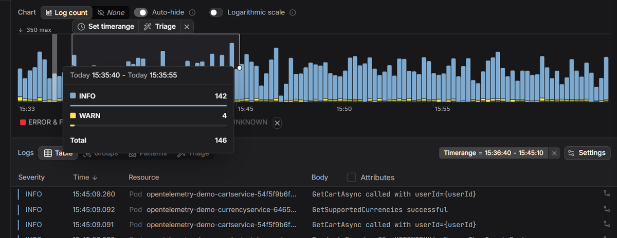
Dash0's OpenTelemetry-native observability keeps all four signals in the same view alongside logs and distributed traces, so when latency spikes you can pivot straight to the traces behind it. Because it's OTel-native, the queries above work without proprietary agents or schema remapping.
 Start a free trial to see all four golden signals for your services in one view. No credit card required.