Last updated: March 31, 2026
Common Metric Query Issues
Learn how to avoid the most frequent PromQL traps with concrete examples and actionable solutions for building better alerts and dashboards.
Range Misaligned to Step Sizes
One of the most subtle and common mistakes in PromQL is using a range selector that doesn't match your visualization or evaluation interval. This creates a situation where your charts and alerts don't reflect the actual behavior you're trying to monitor.
The Problem
When you query with a range selector like sum(increase({otel_metric_name="dash0.spans"}[1m])), you're calculating the total increase over a 1-minute window. However, if your chart's step size is set to 2 minutes, PromQL will evaluate this query every 2 minutes, but each evaluation only looks at the most recent 1 minute of data.
This means you're missing half of the data. If you have a traffic spike that lasts 1 minute but occurs in the middle of a 2-minute evaluation window, you might only capture a fraction of it or miss it entirely.
Concrete Example
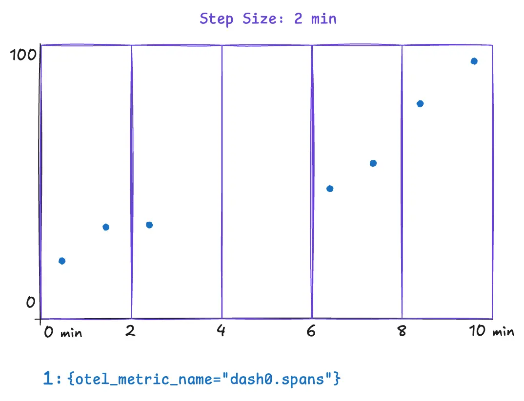
Consider these underlying data points powered by Dash0's synthetic dash0.spans metric. In this example we assume a step size of 2 minutes.
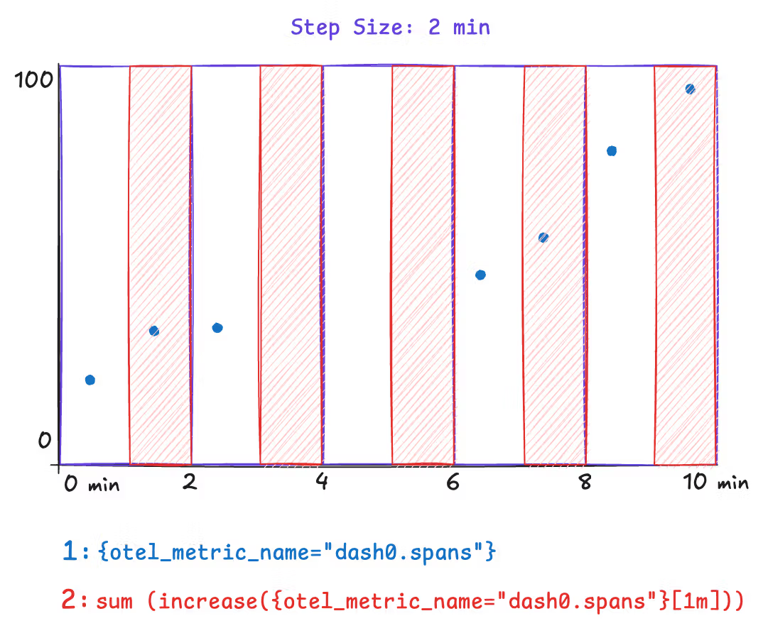
The following example illustrates a metric query that can yield surprising and incorrect results. The metric query is only covering half of the step size. This results in missing data for the time between minutes two and four. Spikes that occur within that time range wouldn't appear in any data point. Notice how the range selector is explicitly set to 1m.
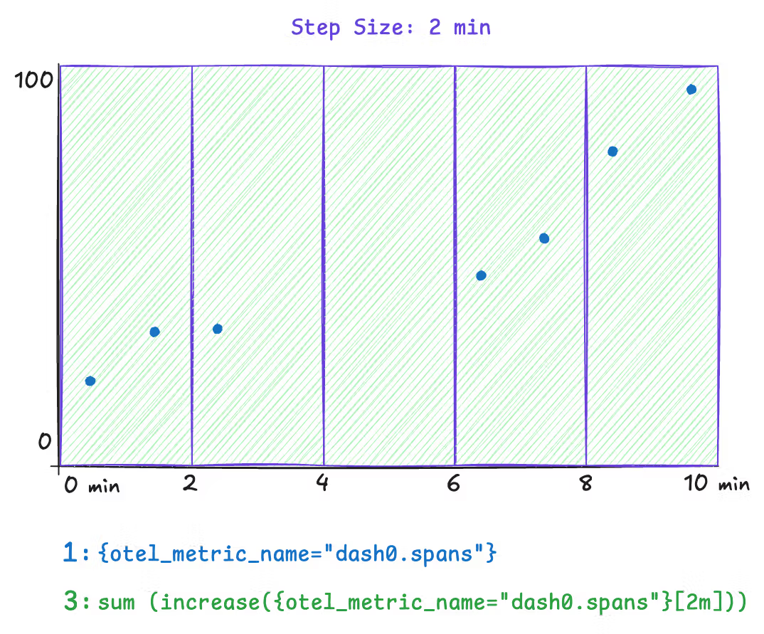
Now compare this with a query where the step size and range are aligned. This query explicitly sets the range to 2m, and all the underlying data is covered by the query evaluation.
However, a downside to this approach is that the step size is dynamic. The step size is dynamically chosen when the Dash0 UI is rendered based on the selected time range and available space for charts. To solve this, use the $__interval and $__rate_interval variables instead of an explicit 2m in the range selector. Both variables remain aligned as closely as possible to the current step size.
Note: Time series chart tooltips communicate the actual step size through the presented timestamps. Within dashboarding, you can even configure a minimum step size.
The Fix
| Query type | Correct variable |
|---|---|
rate() and increase() | $__rate_interval |
avg_over_time() and other aggregations | $__interval |
12345# Correct — adapts automatically to zoom levelrate(http_requests_total[$__rate_interval])# Risky — may return "No data" when zoomed inrate(http_requests_total[30s])
Impact on Alerting
This issue is even more critical for alerts. If your alert rule uses a range of 30s and is evaluated every 1m, you are always going to miss 30 seconds of data in your alert evaluation. Make sure the range is equal to or larger than the evaluation frequency.
Range Misaligned to Collection Intervals
Functions like rate() and increase() need at least two data points within the specified range to compute a result. If the range does not cover enough data points, the query returns empty results and charts stay blank. Other range-vector functions such as irate() or delta() can be affected in the same way.
The Problem
This issue shows up in two common scenarios.
Slightly misaligned ranges. A metric is collected every 60 seconds, but the query uses a [1m] range. Due to timing jitter between collection and evaluation, the 1-minute window often contains only a single data point. With nothing to compare it against, rate() and increase() return no result.
Very sparse collection intervals. Some metrics are only collected infrequently, for example once every hour. In these cases, most practical range values are far too short to ever contain two data points. Using rate() or increase() on such metrics produces empty results almost all of the time.
Concrete Example
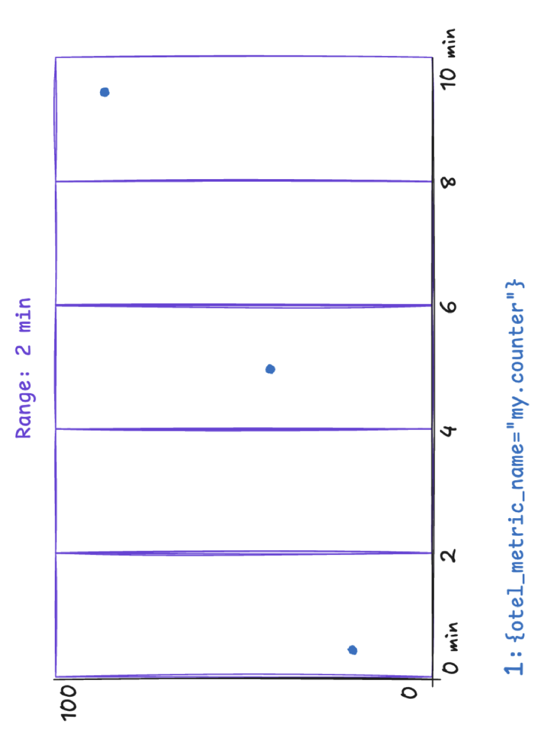
Consider a counter metric collected every 60 seconds. A query like the following uses increase() with a one-minute range:
1increase({otel_metric_name="my.counter", otel_metric_type="sum"}[1m])
Because the range barely matches the collection interval, most evaluation windows contain at most one data point. The chart appears empty even though data is being collected.
To verify that data points exist, remove the increase() or rate() function and plot the raw time series instead:
1{otel_metric_name="my.counter", otel_metric_type="sum"}
This shows the individual data points on the chart and helps you determine the actual collection interval of the metric.
The Fix
The range must be large enough to always contain at least two data points. As a rule of thumb, use a range of at least two times the collection interval. For a metric collected every 60 seconds, a [2m] range ensures that two data points are always covered:
1increase({otel_metric_name="my.counter", otel_metric_type="sum"}[2m])
For charts in Dash0, you can combine the $__rate_interval variable with an increased minimum step size. Because $__rate_interval is set to one minute in Dash0, it is not sufficient on its own when the collection interval is 60 seconds or longer. Setting the minimum step size to two minutes in the chart configuration ensures that $__rate_interval adapts accordingly:
1increase({otel_metric_name="my.counter", otel_metric_type="sum"}[$__rate_interval])
For metrics with very sparse collection intervals, such as once per hour, set the range and minimum step size to match. For example, use a [2h] range for an hourly metric to reliably capture at least two data points.