Last updated: July 12, 2026
Chart Type Format
Dash0's dashboards use Perses' PersesDashboard custom resource format.
- You don't need to understand or know the format to use Dash0's dashboards.
- We recommend using Dash0's user interface to build and export a dashboard.
- This way, you don't need to know about the intricacies of this data format.
- If you wish to know more, however, continue reading.
Understand the Perses Dashboard CR Format
The Perses PersesDashboard CR format is closely aligned with Kubernetes' object format. This is why the structure may look familiar to Kubernetes users and somewhat verbose to others. Let's look at a simple dashboard with one panel to get an overview of the concepts.
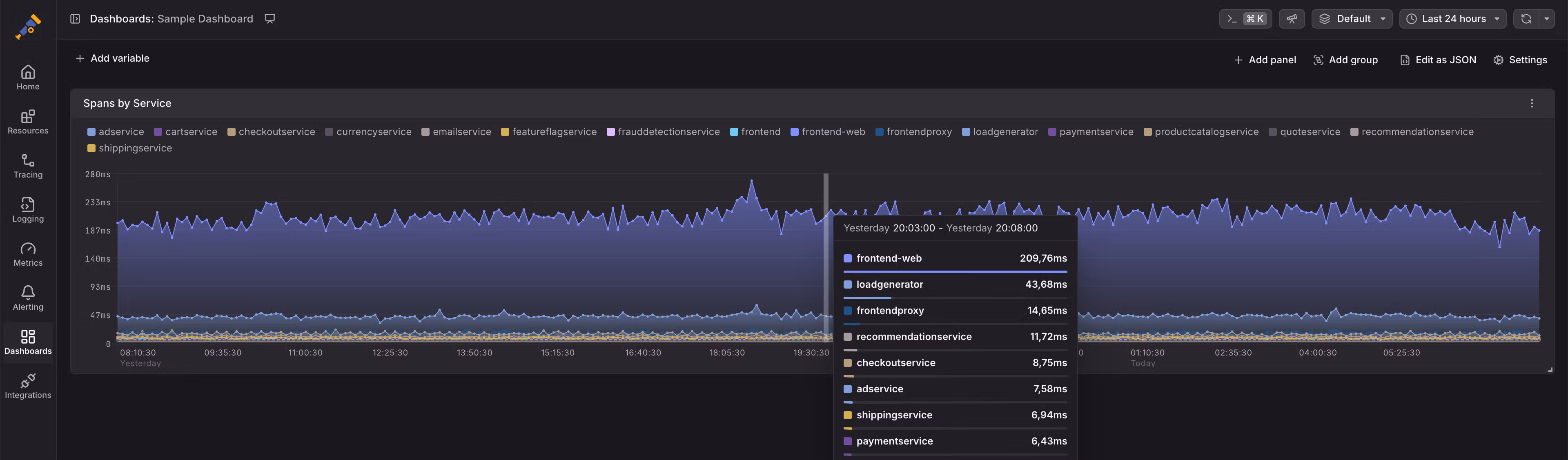
This dashboard leverages Dash0's synthetic span metrics to visualize the 75th percentile span duration per service. We configured it using Dash0's query builder, which generates PromQL queries. The underlying dashboard source is the following (as YAML for ease of reading):
12345678910111213141516171819202122232425262728293031323334353637383940414243444546apiVersion: perses.dev/v1alpha1kind: PersesDashboardmetadata:name: sample-dashboardspec:duration: 24hdisplay:name: Sample Dashboardlayouts:- kind: Gridspec:items:- content:$ref: "#/spec/panels/d660469e-4b97-4dc1-b844-f7456fea0d93"height: 9width: 24x: 0"y": 0panels:d660469e-4b97-4dc1-b844-f7456fea0d93:kind: Panelspec:display:name: Spans by Servicelinks: []plugin:kind: TimeSeriesChartspec:visual:areaOpacity: 0.55display: linepalette:mode: autoyAxis:format:unit: millisecondsmin: 0queries:- kind: TimeSeriesQueryspec:plugin:kind: PrometheusTimeSeriesQueryspec:minStep: 5mquery: histogram_quantile(0.75, sum by (service_name) (rate({otel_metric_name = "dash0.spans.duration"}[$__interval]))) * 1000seriesNameFormat: "{{service_name}}"
Fundamentally, Perses' dashboard CR format has four core elements that are important to understand:
-
Queries: Queries describe how to retrieve data for a panel. For example, the PromQL query and data sources used. In Dash0's case, you never need to select the data source.
-
Panels: Panels are the elements you place on the dashboard, like charts, gauges, and markdown texts. Part of their configuration are queries and typically many visual options like the used formatters, thresholds, and axis configurations.
-
Layouts: Layouts specify how large panels are and where they are located on the screen. They are based on a grid layout system, where each panel assumes a certain number of grid cells (up to 24 cells horizontally). Layouts are referencing panels through JSON references.
-
Variables: Perses supports multiple variable types. Through variables, you can make your dashboard dynamic. For example, you could make the previous example optionally limit the chart's content to a specific subset of services. Variable usage is not shown in the example above.