Last updated: July 24, 2026
Monitor Requests, Errors, and Duration
RED Metrics is a three-panel time series dashboard for understanding the requests, errors, and duration of spans over time.
It is a visualization of the RED methodology — a monitoring framework designed for request-driven systems — adapted to the tracing data model.
You access RED Metrics by selecting the RED tab in the Outliers Map.
Understand the RED Methodology
RED stands for Requests, Errors, and Duration. These three signals together give a complete picture of service health from the user's perspective — if something is wrong, it will almost always show up in one of them.
Because this is in the context of the Trace Explorer, Requests is expressed as Span Count rather than a rate. A span is the native unit of work in distributed tracing — representing a single HTTP call, database query, RPC, or similar operation — so span count is the natural way to measure throughput.
The Outliers Map and RED Metrics are complementary views of the same span data. Use RED Metrics to detect that something is wrong — an error spike, a latency regression — then switch to the Outliers Map to find which spans are responsible.
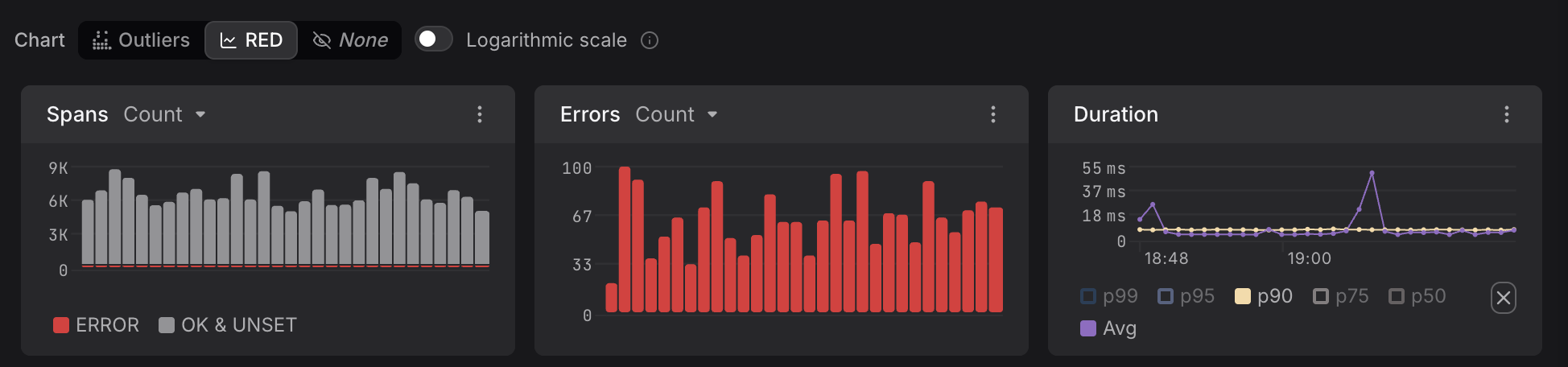
Understand the Panels
Each panel is a time series chart with time on the X-axis and the measured value on the Y-axis.
- Spans: a bar chart showing span volume over time. Bars are split by status — red for
ERRORspans, gray forOK & UNSET— giving a simultaneous view of throughput and error ratio. - Errors: a bar chart showing only the count of error spans over time. Isolating errors in their own panel makes spikes easier to detect.
- Duration: a line chart showing response time percentiles over time — p99, p95, p90, p75, p50, and average. Use this panel to identify latency regressions and understand the shape of your duration distribution.
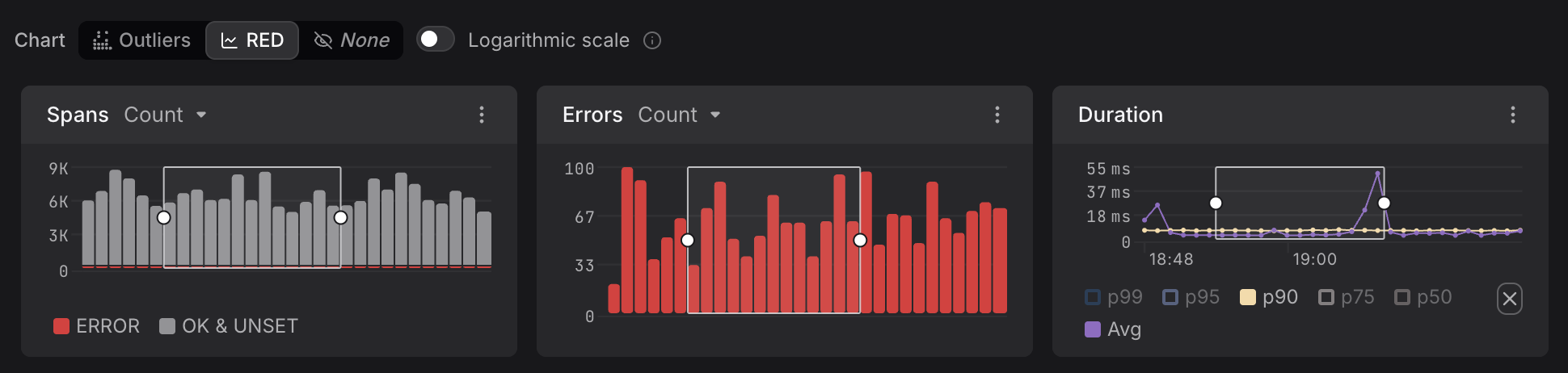
As can be seen in the image above, you can click and drag to select a region of a time series, just like in the Outliers Map. After creating the selection, you can move and resize it to change the region.
Use the Logarithmic Scale
Toggle Logarithmic scale to switch the Spans panel Y-axis from a linear to a logarithmic scale.
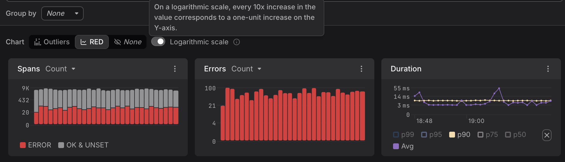
On a logarithmic scale, every 10x increase in value corresponds to a one-unit increase on the Y-axis. This is useful when error span counts are small relative to total traffic — on a linear scale they may be invisible, but on a logarithmic scale the difference remains visible across orders of magnitude.
Set Alerts, Dashboards, and Agent0 Prompts
RED Metrics supports alerting rules directly on any of its three panels, because each panel represents a single, well-defined metric. Dashboards and Agent0 prompts can also be created for each panel, with the context automatically being inferred.
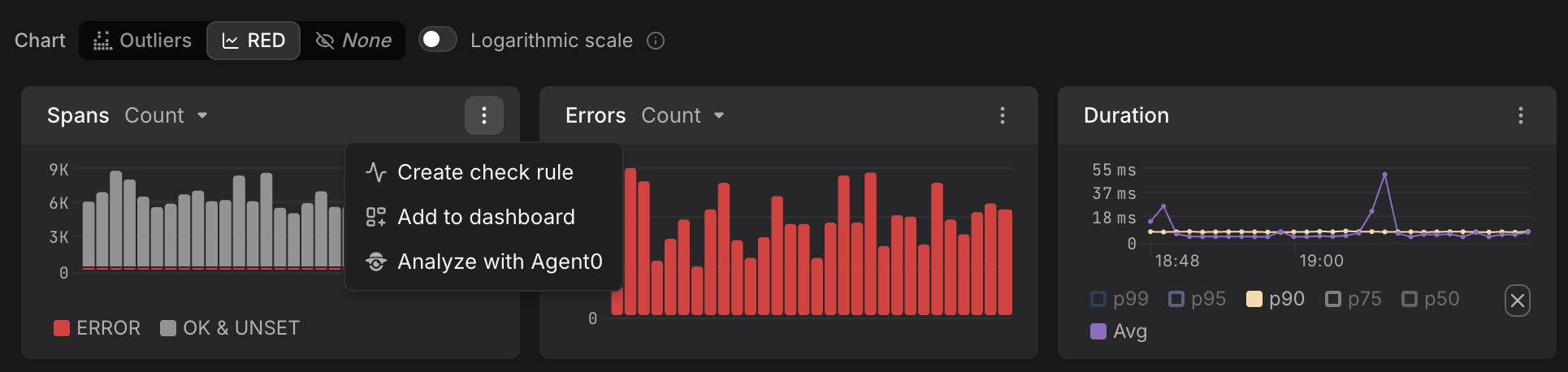
To get started, right-click the ellipsis to the right of each chart and select Create check rule, Add to dashboard, or Analyze with Agent0, as shown above in the first panel.