Last updated: June 9, 2026
Identify Log Severities
The Severity Chart is a visualization for making the error and warning spikes immediately visible against the normal baseline of info and debug activity.
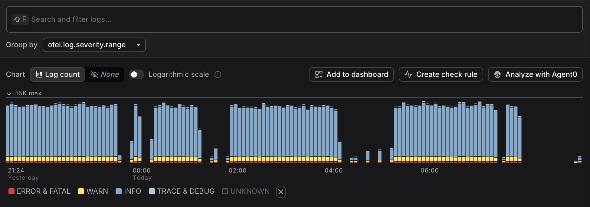
A tall red segment or a sudden change in the yellow band is a reliable first signal that something requires attention.
Understand Severity Ranges
In Dash0, logs are categorized according to their severity range.
In order of descending severity: FATAL, ERROR, WARN, INFO, DEBUG, TRACE and UNSPECIFIED.
These severity ranges are actually specified in OpenTelemetry based on the severity_number.
It can happen that the way you are collecting logs to send to Dash0 does not set the severity_number correctly, and then the log is assigned the UNSPECIFIED severity range.
This is very common, for example, when reading pod logs in Kubernetes using the filelogreceiver of the OpenTelemetry Collector.
Dash0's Log AI can fill in the missing severity_number of unstructured logs, and the built-in processing of JSON logs can pick up the severity from a variety of attributes of structured logs.
Chart Legend vs. the Filter Bar
Clicking a band in the chart legend toggles the entire group — clicking ERROR & FATAL shows or hides both together, since that is the most common workflow.
If you need to isolate a specific level within a group — for example, to see only FATAL records without ERROR — use the Filter above the log table instead. Select the otel.log.severity.range attribute and choose the exact level you want. The Filter provides fine-grained control that the chart legend deliberately omits to keep the common case simple.
Select a Timerange
Click and drag to select a region of the Severity Chart. After creating the selection, you can move and resize it to change the region.
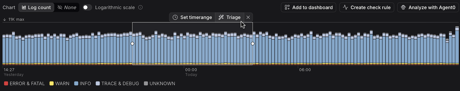
The selection:
- Updates the Table, Groups, Patterns, and Triage views to show only records from that interval — no manual time range adjustment is needed.
- Defines the dashboard that is created when you click Add to dashboard above the selection.
- Defines the check rule that is created when you click Create check rule above the selection. This lets you quickly set up alerting on patterns you've already identified — such as error spikes or unexpected severity changes — without configuring the rule from scratch.
- Defines the inferred context in the Agent0 prompt when you click Analyze with Agent0 above the selection.
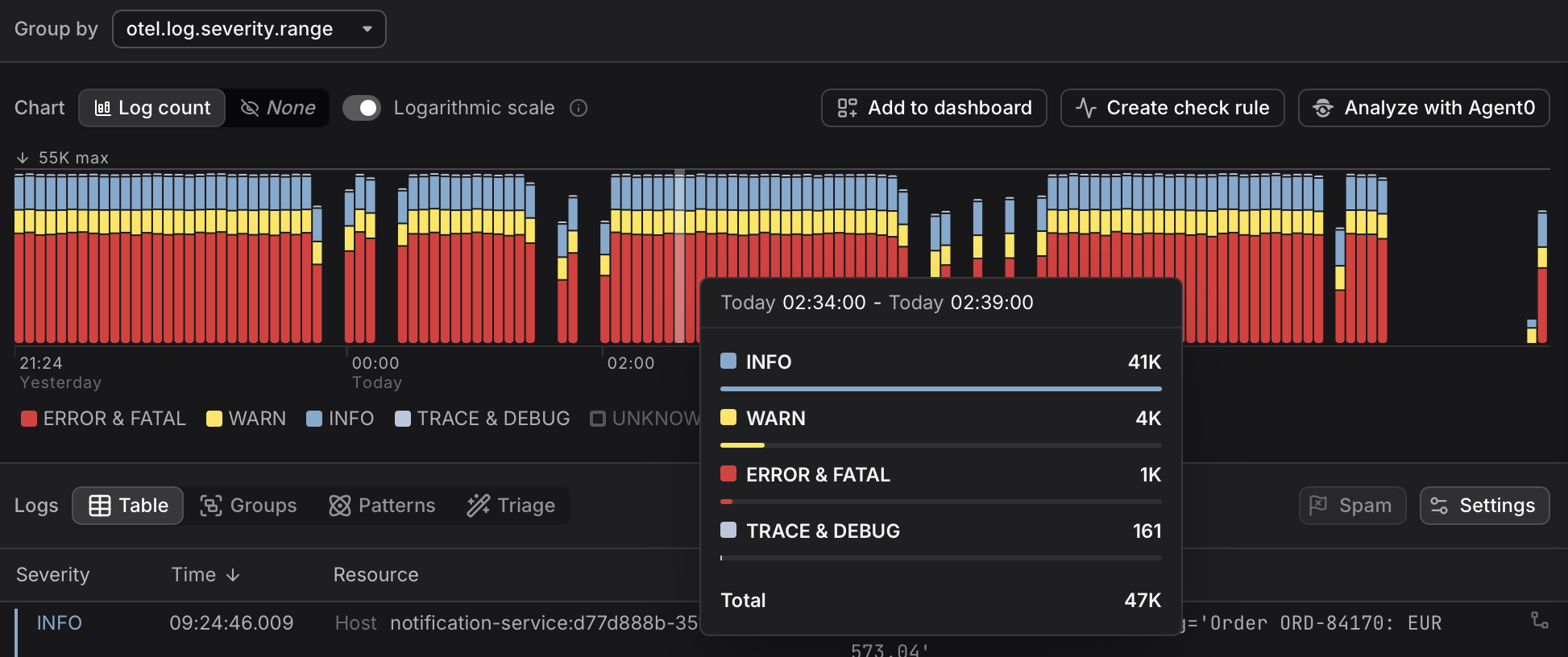
The totals shown in the top bar of the Explorer reflect the counts for the full selected time range and environment:
![]()
Use the Logarithmic Scale
When one severity group has significantly higher volume than others, lower-volume groups can be hard to see in the default linear scale.
In linear scale, if one severity group has 1,000 records and another has 10, the smaller group occupies roughly 1% of the chart height — effectively invisible as a thin sliver against the dominant color.
Switch to Logarithmic scale above the chart to make all severity bands visible simultaneously.
In logarithmic scale, bar height is proportional to the order of magnitude of the count rather than the raw count. Dash0 uses a base-10 logarithm, so each step up in height represents ten times as many records:
| Record count | log₁₀ value | Approximate relative height |
|---|---|---|
| 1,000 | 3 | 100% |
| 100 | 2 | ~67% |
| 10 | 1 | ~33% |
In a Severity Chart displaying 1000 INFO logs, 100 WARN logs and 10 ERROR logs, the bar for INFO logs will be two and three times higher than those for WARN and ERROR, respectively.
This makes it possible to see at a glance that a low-severity band is elevated even when an error band dominates the chart.
Use logarithmic scale whenever one severity dominates and you want to check whether another severity is quietly elevated. Switch back to linear scale when you need to compare absolute volumes accurately.