
Last updated:
Add Annotations
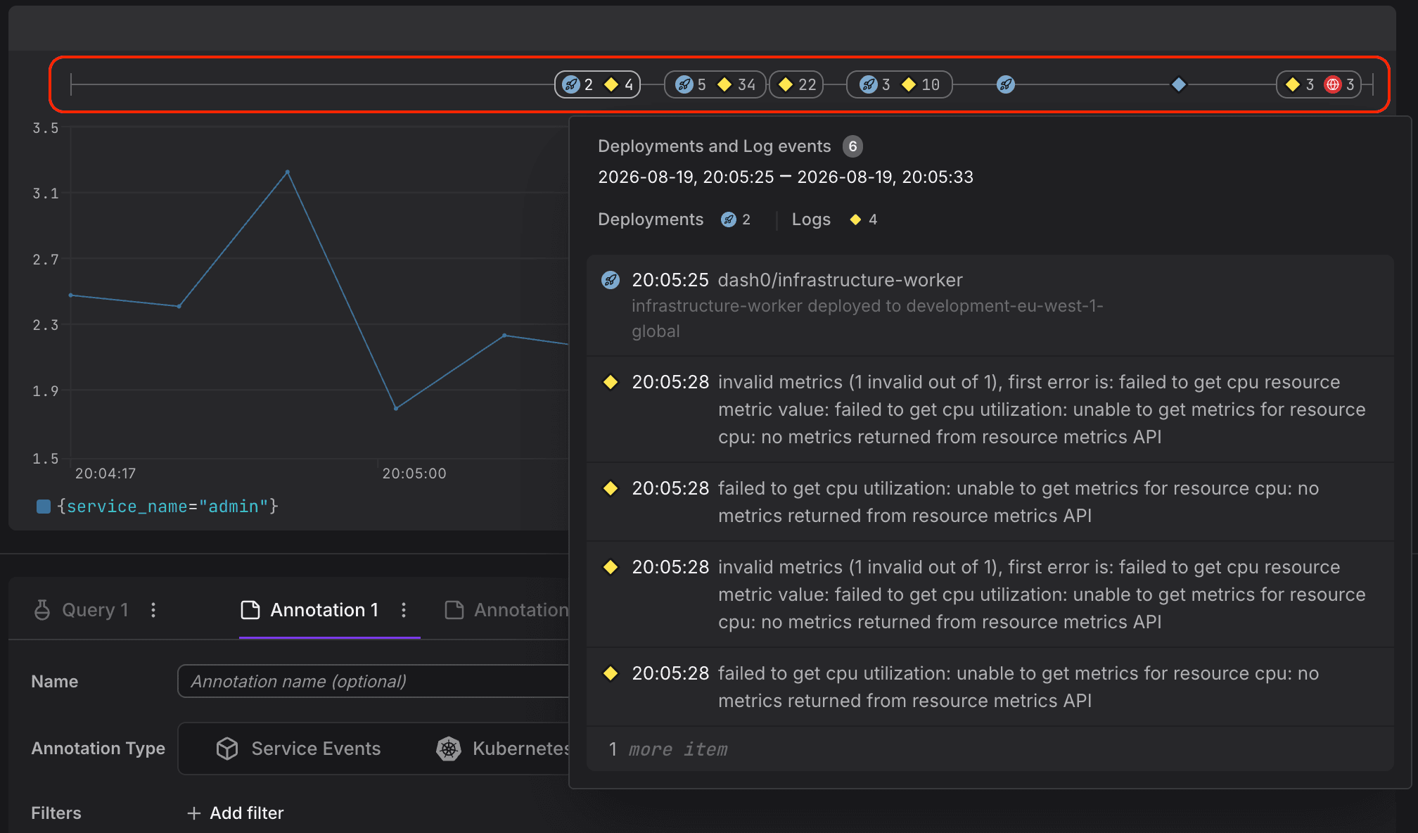
Annotations overlay events on charts so you can see what happened alongside your metrics. On time-series charts, events appear as markers on the timeline. On GeoMaps, they appear as geographic pins showing where events occurred. If a chart shows a latency spike, an annotation might show that a pod restarted or a container got rescheduled seconds before, right there on the same chart.
Prerequisites
Annotations display log events already ingested into Dash0. In OpenTelemetry, a log event is any log record that carries an event.name attribute (or the event.auto.event.name fallback). Make sure at least one source of log events is active:
- Service Events: Log events that also carry a
service.nameattribute, together with, optionally, aservice.namespaceattribute. These can overlap with Kubernetes Events and other log events. - Kubernetes Events: The Dash0 Operator for Kubernetes (v0.92.1+) automatically collects Kubernetes events from monitored namespaces and ingests them as log events.
- Structured Log Sources: Any structured log record with an
otel.event.nameattribute is a log event. You can also create log events directly from the Dash0 CLI. - Deployment Events: Log events with the event name
dash0.deployment, emitted from your delivery pipeline. Emit them with the Send Log Event GitHub Action ordash0 logs send --event-name dash0.deploymentfrom the Dash0 CLI. For the attributes a deployment event carries, see Deployment Events.
Add Annotations to a Panel
Time-Series Charts
- Open a dashboard and click Edit on the panel you want to annotate.
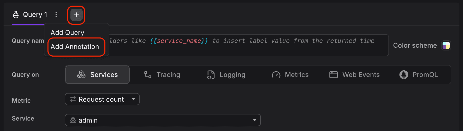
- Below the query editor, next to the Query tab, click +, and then select Add Annotation.
When annotations are active, a secondary timeline appears at the top of the panel. Each mark represents a matching log event; hovering over a mark reveals the event details. You can add multiple annotations per panel to layer different event scopes on the same chart.
- Select an Annotation type to filter which log events are shown, Service Events, Kubernetes Events, Deployments, or Log Events. For Service Events, select a Service to scope the annotation to.
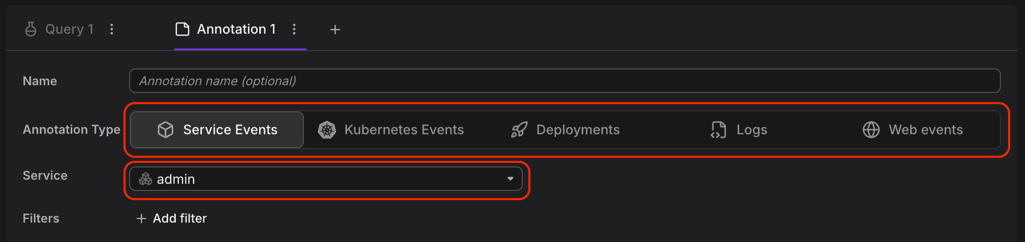
- Optionally click + Add filter to narrow results by attributes such as event reason, severity, or resource name.
- The annotation markers appear immediately on the chart preview.
- Save the panel to persist the annotation for all dashboard viewers.
You can add multiple annotations to a single panel, each tracking a different event type or service.
GeoMaps
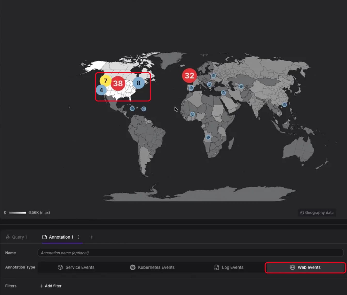
GeoMap panels display event annotations as geographic pins showing where events occurred.
- Open a dashboard and click Edit on the GeoMap panel.
- Scroll to the Annotation settings section below the query editor.
- Click Add Annotation.
- Select an Annotation type (Web Events, Service Events, Kubernetes Events, or Log Events). Deployments are available on time-series charts only.
- Configure filters to scope which events appear as pins.
- The pins appear immediately on the map preview.
- Save the panel to persist the annotations.
Event pins use the same markers, colors, and severity indicators as timeline annotations. They resolve from standard OpenTelemetry geo attributes (see the OpenTelemetry semantic conventions for geo attributes).
Enable the Show Cities toggle in the GeoMap panel settings to overlay city reference points for geographic orientation.
View Event Details
Time-Series Charts
Events appear as markers along the chart timeline. When multiple events occur within a short time window, they are grouped into a single indicator that shows the total event count.
Click on any marker to expand a detail panel that lists:
- The time range of the grouped events
- Event categories and their counts
- Individual events with timestamp and description
- A link to view remaining items if the list is truncated
GeoMaps
Events appear as pins at their geographic locations. As you zoom out, nearby pins cluster into bubbles that show the event count and take the most severe color in the group. Zoom in to split clusters into individual pins.
To view event details:
- Click a pin: Opens a tooltip with event information
- Alt/Option + Click: Pins the tooltip open so you can click through to the underlying events
- Zoom with trackpad (macOS): Pinch to zoom directly on the map
If your telemetry includes exact coordinates and locality data, pins render at precise locations. Otherwise, they resolve to country or region level based on available geographic attributes.
Further Reading
- Add Panels — Place and arrange panels on the dashboard canvas
- Configure Panels — Set chart type, formatting, and visual style for a panel
- Build Queries — Construct the queries that feed a panel
- GeoMap — Display event annotations as geographic pins