Last updated: July 14, 2026
Configure Panels
When you click Add panel, the panel designer below is shown. In the center of the designer, you see the chart preview. Below it, you see the Query Builder and vertically on the right you see the configuration panel.
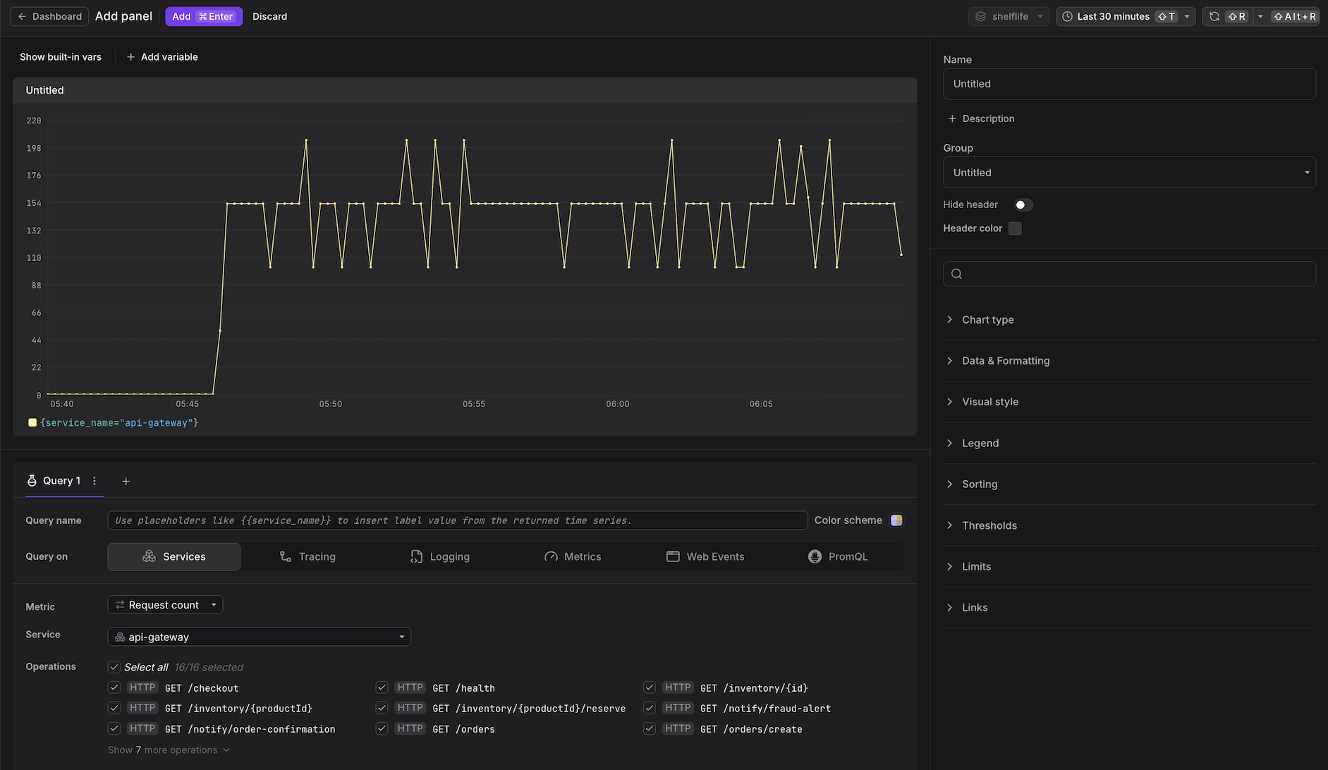
The configuration of panel options is the core activity in dashboard design.
Panel options are organized into several categories, described below.
The options that are available depend on the selected chart type.
Configure General Settings
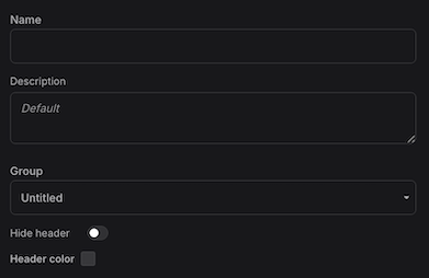
- Name: An optional display name shown in the panel header.
- Description: An optional text description displayed in the panel header next to the name.
- Group: Groups organize panels into collapsible sections on the dashboard canvas.
- Hide Header: Removes the panel header for a cleaner visual appearance.
- Header Color: Customizes the panel header background color.
Configure Data Sources
Below the chart, configure the queries that feed it.
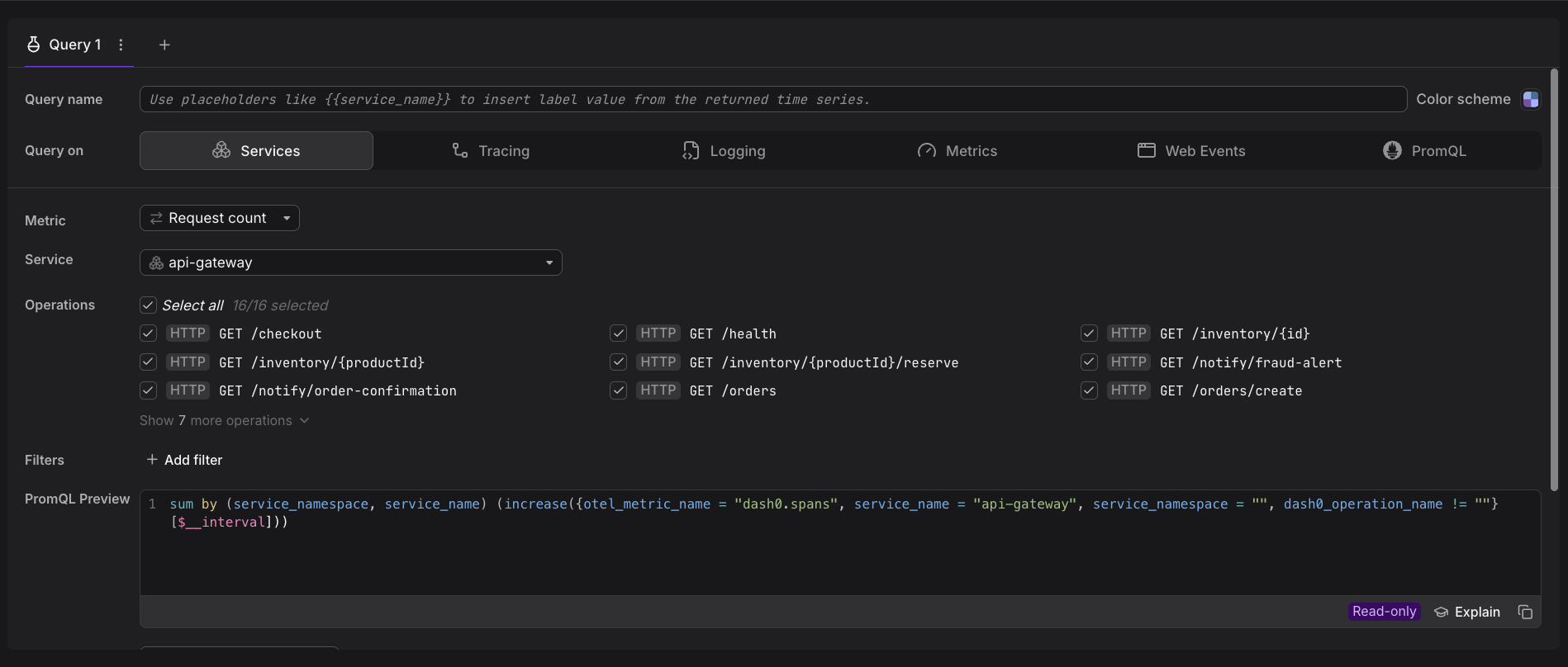
See Build Queries for details on constructing queries.
Configure Chart Types
In the panel on the right, expand Chart type to see the full list of charts available.
Dash0 supports multiple chart types, each suited to different visualization needs.
See Reference: Chart Types for details on each type of chart.
Configure Data & Formatting
Through the data formatting options, you can configure how numerical values are presented.
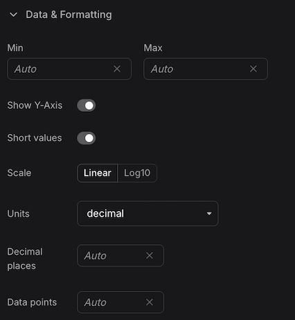
- Min/Max: This setting configures whether the chart's min/max values are dynamically determined based on the seen data or set to fixed numbers. Fixed numbers can be handy for charts visualizing percentages or when there is a genuinely known minimum/maximum. You can also choose to hide the min/max value presentation entirely from the min/max lines.
- Units: This defines how to format the number. You can format numbers as time units (milliseconds), bytes, dollars, and more.
- Short Values: Units can further be formatted in short mode, resulting in 1k instead of 1000 and 1KB instead of 1024B.
- Decimal Places: Defines how many decimal places should be shown when formatting the numbers.
- Scale: Appearing only for specific panels, it switches the y-axis scale between linear and logarithmic scales. The logarithmic scale is handy when you have data with very small and very large values. A linear scale can make it difficult to see the changes in the smaller values. A logarithmic scale compresses the larger values, making it easier to visualize the entire range.
- Calculation: This setting determines how multiple data points in a time series are reduced to a single value for display. Available options include:
- First / Last: Returns the first or last data point in the series, which may include NaN (no data) values.
- First Value / Last Value: Returns the first or last numeric data point, skipping any NaN values.
- Mean: Calculates the average of all numeric values in the series.
- Sum: Adds up all numeric values in the series.
- Min / Max: Returns the smallest or largest numeric value in the series.
- Instant: Returns the value at the end of the time range, optimized for point-in-time queries. This is useful when you only care about the current state rather than historical data.
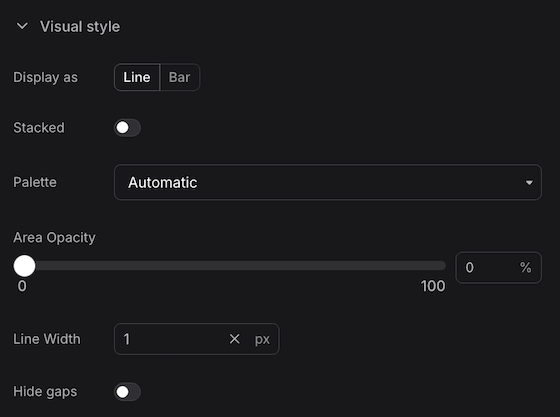
Configure Visual Style
Through the visual style options, you can configure colorization options for your panels and charts.
Color Palette
Dash0 offers several colorization options for your panels. For example, to colorize time series within a chart, we default to an automatic palette that is designed to work in most cases. However, you can also use D3's categorical palette (and its dark variant).
The automatic palette has a helpful additional capability beyond just alternating between colors: It inspects the underlying data's attributes (or labels in Prometheus terminology) for attributes describing a status.
For example, if the time series carries the http.response.status_code attribute, the automatic color palette interprets the value and chooses a fitting color based on semantics. This mechanism also works for other attributes specified within OpenTelemetry's and Dash0's semantic conventions, such as log severities, span status codes, gRPC status, exception, and error attributes.
Coloring Individual Time Series
An everyday use case is choosing the color of a time series. For example, a line representing errors in a time series chart should be red. Dash0 does this automatically (see above) when the data carries semantic attributes indicating this. Sometimes, however, you will want to do this manually.
The easiest way to set the color of a series is to use the color scheme option at the right side of the query name. You can use the color scheme override to force a color to the results of that particular query.
There's an alternative option which becomes useful if that button is not available, which is to attach a new attribute to each entry in the series, thus instructing the coloring system to kick in. You can use the PromQL editor to add an additional label to your time series via the label_replace function:
12345678label_replace(# Your existing PromQL query goes heresum(increase({otel_metric_name = "dash0.spans", otel_span_status_code = "ERROR"}[$__interval])) > 0,# New label key & value to add"dash0_color", "ERROR",# Existing label key & value to remove (in this case no key to remove)"", "")
This attaches the special label dash0_color with the value ERROR to all the time series. Dash0 interprets this label and makes the time series red, the semantic color for errors.
Dash0 supports additional values for dash0_color to make time series go red, yellow, blue, and gray. The following table shows the available values:
| Label Value | Color |
|---|---|
ERROR | red |
WARN | yellow |
INFO | blue |
UNKNOWN | gray |
Configure the Legend
- Display Mode: Show the legend as a table or a list.
- Position: Configure placement relative to the chart area.
Configure Sorting
Sort displayed series by attribute name or by value. Useful for identifying top or bottom performers across multiple series.
Configure Thresholds
Define threshold lines or regions on the visualization. Thresholds provide visual indicators for acceptable ranges, warning levels, or critical boundaries.
Configure Limits
Dash0 enforces a limit in terms of how many time series it returns per query. This is done to protect the system and to keep panels readable.
For example, the time series charts default to showing 20 time series, at most. This translates into 20 lines for line charts per query. You can raise the limit by changing the Limits setting, to up to 100 lines per query, 100 rows in a table, or 100 gauges. These large limits commonly don't make sense, but this can be helpful while crafting the correct queries.