
Last updated: August 18, 2026
Track Cost
The Cost tab makes spend visible at every level, which is the starting point for connecting spend to outcomes.
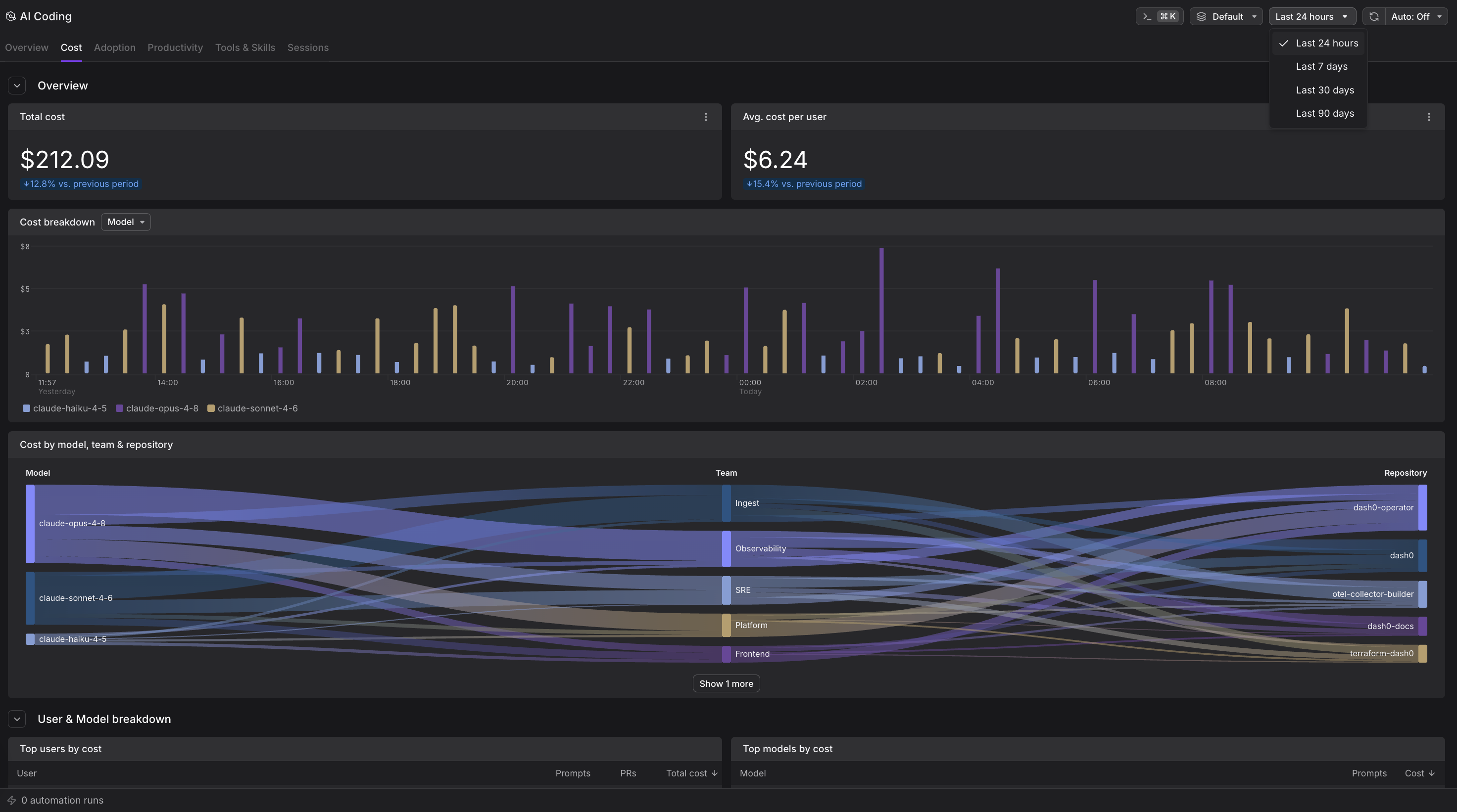
What Track Cost Shows
- Total cost and average cost per user, each compared against the previous period.
- Cost by model: A stacked time series showing how spend splits across models, for example
claude-opus-4-8,claude-sonnet-4-6, and any models reported by other connected agents. A frontier model often dominates spend even when it does not dominate session count, which is the signal for a model-governance conversation. - Cost by team: The same spend, grouped by team.
- Top users by cost: A table ranking users by spend, with their prompt and pull-request counts.
- Top models by cost: A table ranking models by spend, with the prompt count behind each. Read against cycle time on the Productivity tab, this is the throughput-per-dollar instrument: a model that takes more prompts but costs far less per token, and reaches the same cycle time, is the better economic choice, while one that is cheaper per token but doubles cycle time is not.
Use this tab to spot which models and teams drive cost, and whether a small group of heavy users accounts for most of the bill.
Cost is computed from token counts using a Dash0-maintained pricing catalog. For developers on flat-rate or subscription plans, the provider does not expose per-session usage, so the figures are an estimated API-equivalent cost: what the same tokens would cost at pay-as-you-go rates. For those seats, this estimate is the only window into per-developer and per-model usage.
How to Use Track Cost
Spot which models drive spend. The cost by model chart shows which models dominate your bill. A frontier model may cost significantly more per token but deliver faster results. Compare this against cycle time on the Productivity tab to understand if the premium is worth it.
Find your heaviest users. The top users table ranks developers by spend. High-spend users may be power users getting exceptional value, or they may be using inefficient workflows. Drill into their sessions to understand the pattern.
Track cost trends over time. The time series view shows whether spend is climbing, stable, or dropping. Sudden spikes often indicate new team members onboarding, a major refactoring, or a shift to more expensive models.
Compare teams. The cost by team breakdown shows which parts of your organization use AI coding most heavily. Use this for cost allocation or to identify teams that could benefit from training on cost-efficient patterns.
Further Reading
- Track Adoption: See who uses AI coding tools and how adoption is spreading.
- Measure Productivity: Connect spend to velocity with cycle time metrics.
- Explore Sessions: Drill into individual sessions to understand costs in detail.