Last updated: June 19, 2026
Monitor Website Overview
Overview in the Websites Explorer is the landing view inside each website.
It is an at-a-glance picture of traffic volume, frontend performance, and user geography, all in a single scrollable page.
Use the Overview KPIs
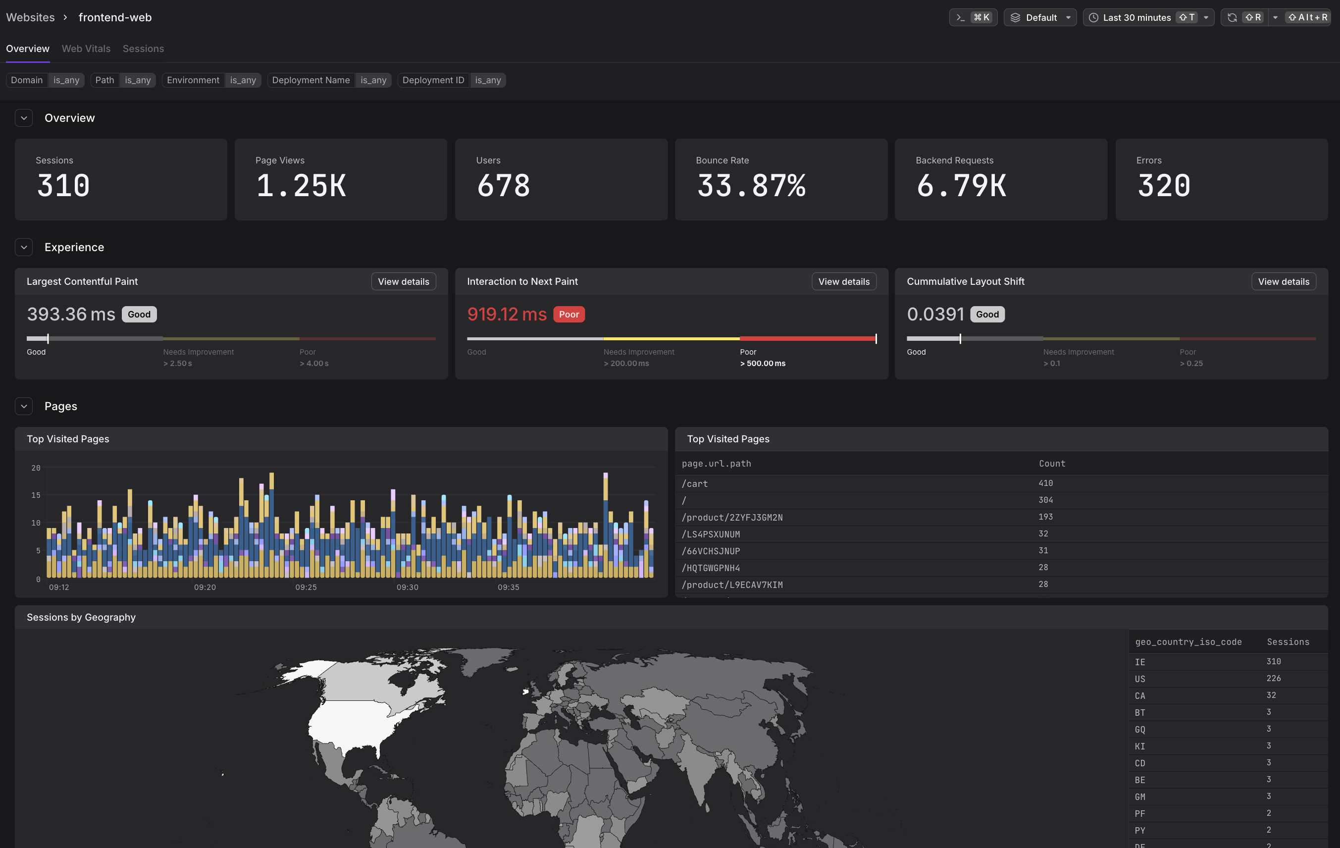
The Overview section at the top of the tab shows six counters for the selected time window.

| KPI | What it measures |
|---|---|
| Sessions | Total number of user sessions started |
| Page Views | Total number of page loads and SPA navigations |
| Users | Number of distinct users who created those sessions |
| Bounce Rate | Percentage of sessions where the user left without a second interaction |
| Backend Requests | Total HTTP requests made by the frontend to backend services |
| Errors | Total unhandled JavaScript exceptions and promise rejections |
A session begins when a user opens the website and ends after 24 hours of inactivity or when the browser tab is closed. A single session can span multiple page views and multiple tabs.
Use the Experience Gauges
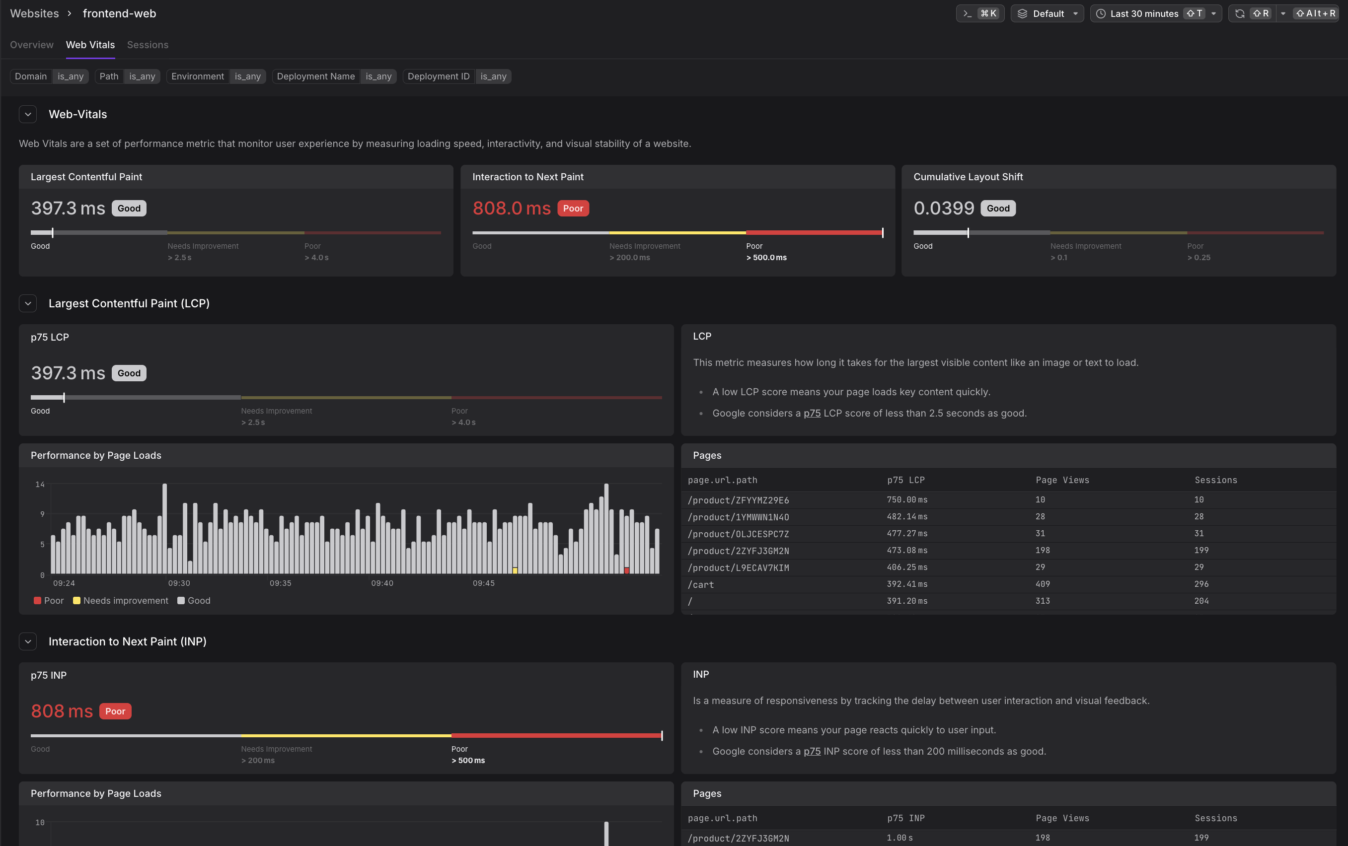
The Experience section shows the p75 Core Web Vital score for each of the three vitals, displayed using Google's own thresholds and labels.
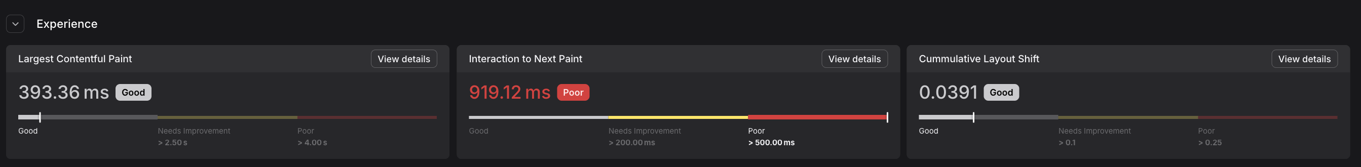
Each gauge shows the current p75 value on a color-coded scale from Good (left) to Poor (right). A score in the red zone means more than 25% of your users are experiencing performance below the Poor threshold.
For detailed explanations of each vital, what they measure, thresholds, and why p75 is used, see Understand Web Vitals.
Click View details on any gauge to jump directly to that vital's section on the Web Vitals tab.
Explore Top Visited Pages
The Pages section shows which pages receive the most traffic over the selected time window. It includes both a stacked bar chart and a ranked table.
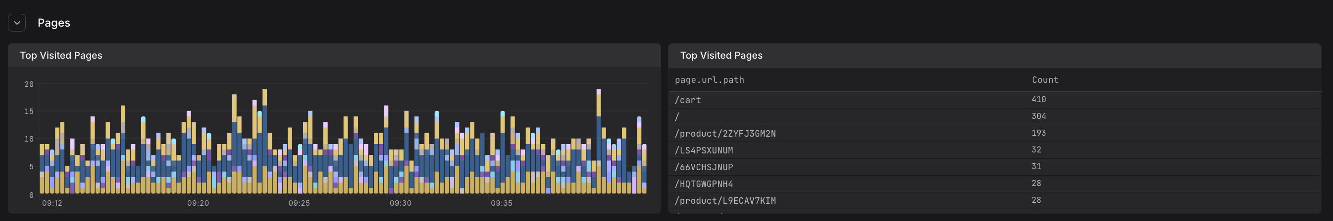
- The chart plots page view counts over time, with each color representing a different URL path. Hover over any bar to see a tooltip with the per-path breakdown for that time slice.
- The table ranks pages by total page view count, making it easy to see which paths drive the most traffic.
Use this section to understand which parts of your website are most actively used, detect traffic shifts after deployments, or identify pages that may warrant extra performance attention.
View Sessions by Geography
The Sessions by Geography section at the bottom of the Overview tab displays a world map with session volume encoded as shade intensity, alongside a ranked country table showing geo_country_iso_code and session count.
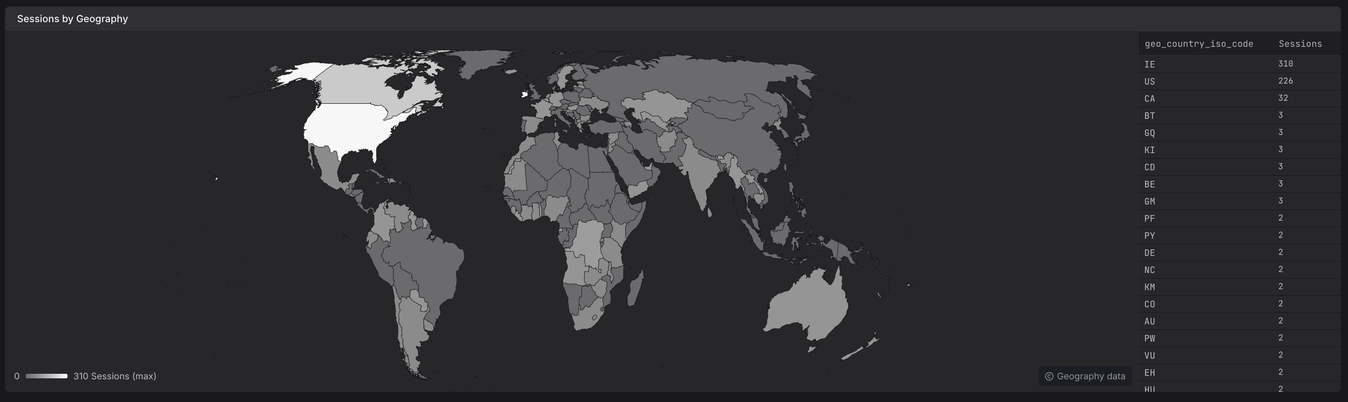
Use the geography view to:
- Understand where your users are located
- Detect unexpected traffic from unusual regions
- Prioritise CDN or infrastructure investments based on user distribution
Apply Filters
The filter bar at the top of the page lets you narrow all Overview data to focus on specific segments of your traffic.
- All filters apply simultaneously across the entire tab — affecting the traffic KPIs, web vital gauges, pages chart, and geography map.
- You can filter by page path, deployment environment, deployment name, deployment ID, country, and more.
- Filters are particularly useful for comparing performance before and after deployments or analyzing regional differences.
For a complete guide to filtering in the Web Vitals tab, including available attributes and examples, see Filter Sessions and Data.
Further Reading
- About Website Monitoring. Overview of the Websites Explorer and how the Overview tab fits into the broader experience.
- Understand Web Vitals. Definition and thresholds for Core Web Vitals displayed in the Experience gauges.
- Filter Sessions and Data. Complete guide to filtering Overview data by page, deployment, country, and more.
- Analyze Web Vitals. Detailed Web Vitals tab for drilling deeper into p75 scores.
- Investigate Sessions. Sessions tab for exploring individual sessions that contribute to Overview metrics.