Last updated: June 19, 2026
Analyze Web Vitals
Web Vitals in the Websites Explorer is a detailed breakdown of each Core Web Vital — LCP, INP, and CLS, with per-page rankings and performance-over-time charts.
Use it to identify pages that are dragging your scores down and to understand whether performance problems are improving or getting worse over time.
Understand the Vital Summary Gauges
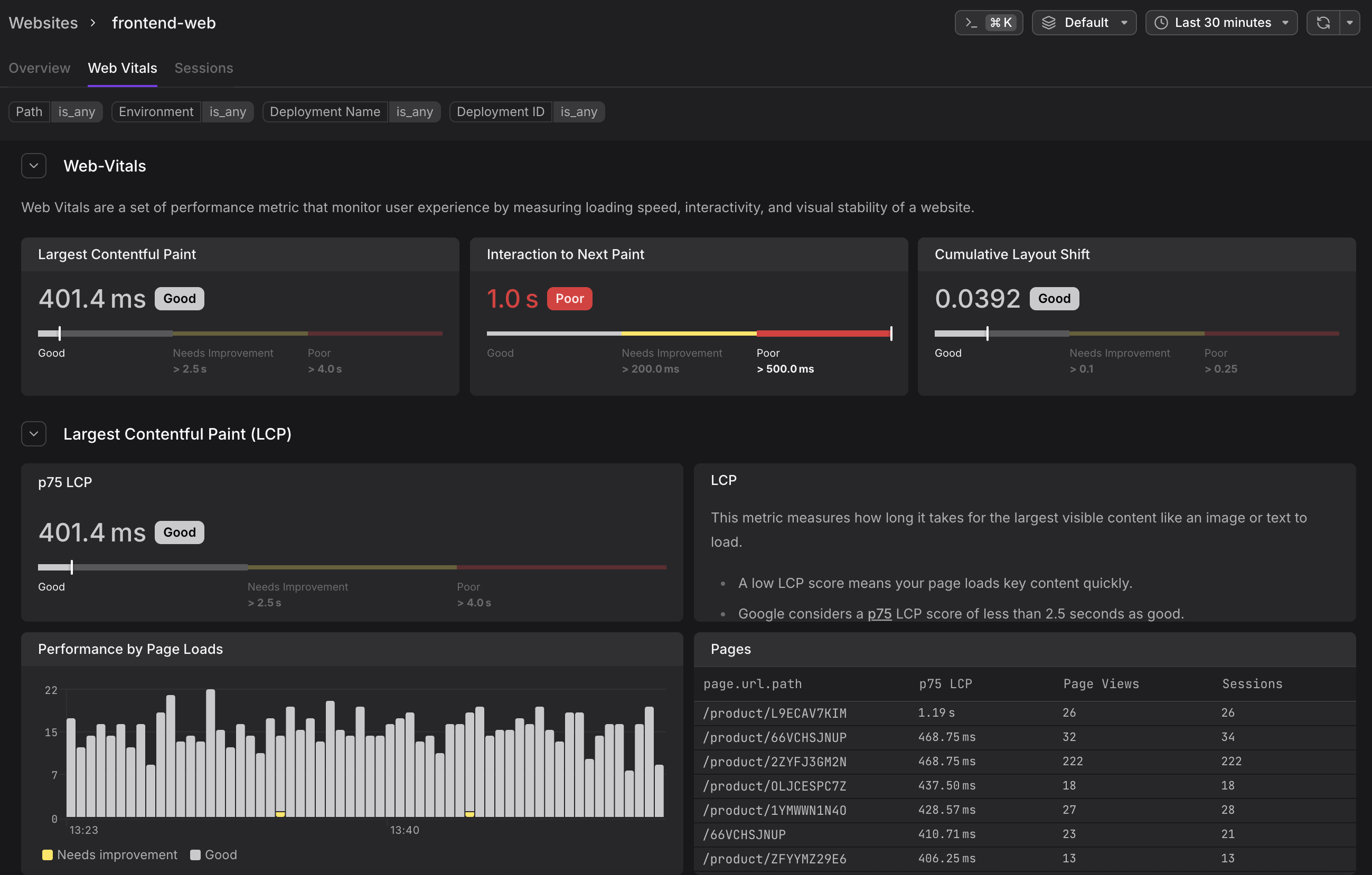
At the top of the Web Vitals tab, a summary row shows the p75 score for all three vitals at once — LCP, INP, and CLS — each with a color-coded Good/Needs Improvement/Poor label. This gives you an instant health check before you scroll into the per-vital sections.
For details on what each vital measures, why p75 is used, and the official Google thresholds, see Understand Web Vitals.
Each vital then has its own collapsible section further down the page.
Understand the Per-Vital Sections
Each vital section (LCP, INP, CLS) is collapsible and contains four components:
p75 Gauge and Description
Shows the current p75 score for the full website (across all pages and all users), with the colored threshold bar beneath it. The gauge uses Google's official thresholds. A description panel next to the gauge explains what the vital measures and when it's captured.

For threshold values and what each vital measures, see Understand Web Vitals.
Performance by Page Loads Chart
A time-series bar chart where each bar represents a time bucket and is color-coded by the proportion of page loads that fell into each band. The chart visualizes the distribution of Good (white/grey), Needs Improvement (yellow), and Poor (red) scores over time.
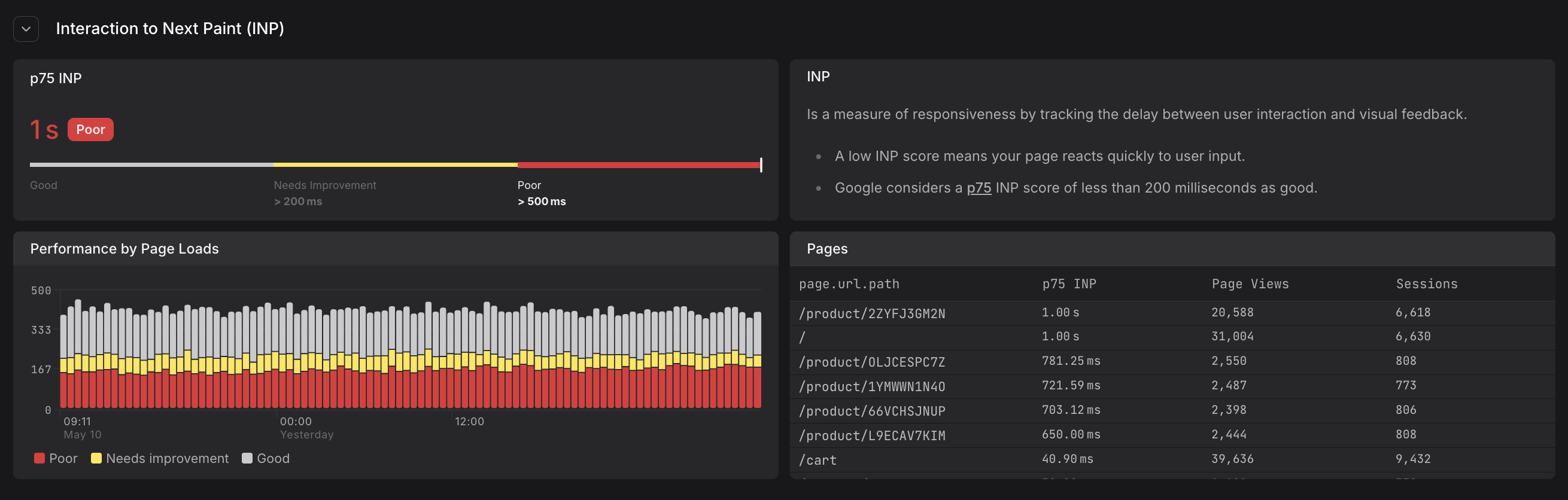
A chart that is mostly red across the time window indicates a persistent performance problem. Isolated red spikes may point to a deployment event or a traffic surge from slower devices.
For details on each of the vitals and their meaning, see Understand Web Vitals.
Pages Table
A ranked table listing every page path alongside its p75 vital score, page view count, and session count. The table is sorted by the vital score by default, making the worst-performing pages appear at the top.
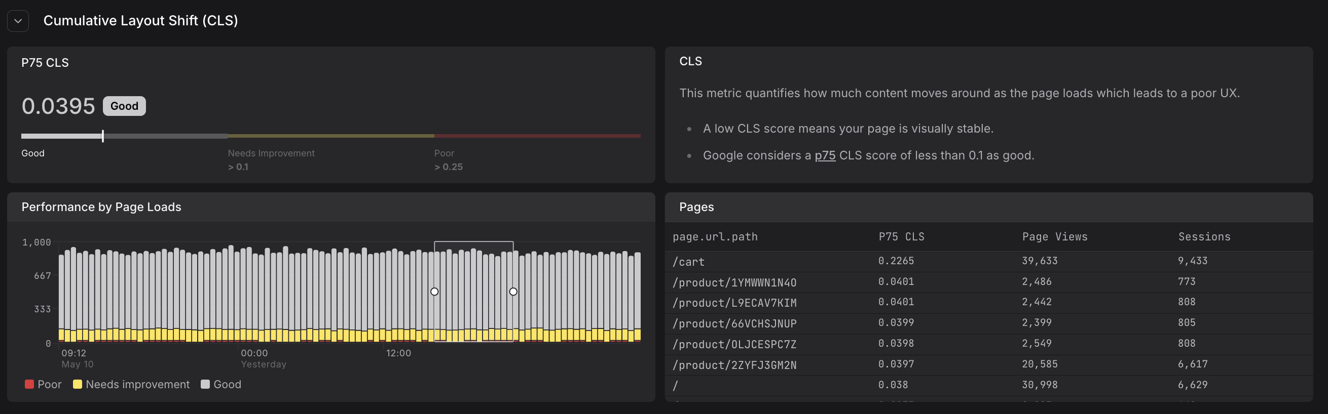
| Column | Description |
|---|---|
| page.url.path | The URL path of the page |
| p75 [vital name] | The 75th percentile score for this path (e.g., p75 LCP, p75 INP, p75 CLS) |
| Page Views | How many page loads contributed to this score |
| Sessions | How many distinct sessions included this page |
Click any row in the Pages table to jump to the Sessions tab filtered to that page path and vital. This shows you the individual user sessions that experienced that performance level, including their full navigation sequence and web vital timeline.
Apply Filters
The filter bar at the top of the tab lets you narrow web vital data to specific segments.
- All filters apply simultaneously across the entire tab — affecting the p75 gauges, performance charts, and pages tables.
- You can filter by page path, deployment, browser, and more. Filtering by deployment is particularly useful for comparing web vital scores before and after a release.
For a complete guide to filtering in the Web Vitals tab, including available attributes and examples, see Filter Sessions and Data.
Further Reading
- Understand Web Vitals. Definition, thresholds, and measurement methodology for LCP, INP, and CLS, including why p75 is used.
- Filter Sessions and Data. Complete guide to filtering web vital data by page, deployment, browser, and more.
- Monitor Website Overview. Overview tab with traffic KPIs and Experience gauges for web vital scores.
- Investigate Sessions. Drill down from poorly performing pages to individual user sessions.