Last updated: June 8, 2026
Identify High-Cardinality Metrics
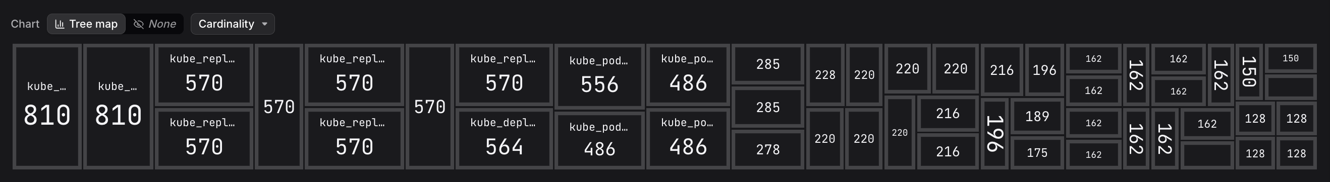
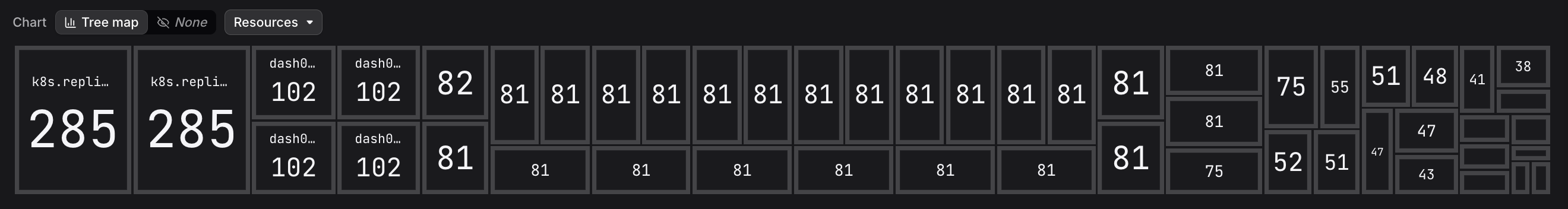
The Tree Map at the top of the Metric Explorer gives you an immediate visual overview of your metric landscape. Each tile represents a metric, sized proportionally by the dimension you select, so the metrics that deserve attention are the largest tiles on screen.
Choosing a Dimension
Use the dimension dropdown (default: Cardinality) to change what the tile sizes represent:
| Dimension | What it highlights |
|---|---|
| Cardinality | Metrics with many unique time-series combinations — useful for identifying unexpectedly high-cardinality data (e.g. metrics that accidentally include random or high-variance attribute values). |
| Resources | Metrics reported by the largest number of distinct resources. |
| Score | A Dash0-calculated score that divides time-series cardinality by resource count, surfacing metrics that have disproportionately many time series per resource. |
| Data Points | Metrics with the highest raw data-point count in the selected time range. |
For example, switching to Resources redraws the map with resource counts, which is useful when you want to understand which metrics are emitted most broadly across your infrastructure rather than which have the highest cardinality.
Acting on What You Find
The tree map is a jumping-off point.
Once a large tile catches your eye:
- Locate the corresponding metric in the Metrics Table below the Tree Map.
- Click the metric row to open the Metric Sidebar and inspect its attributes and associated resources.
- Select View in Query Builder to open the metric in the Query Builder and investigate the underlying time-series data.
A high cardinality score is not always a problem — but it is a prompt to ask whether all of those dimensions are actually needed. If random or unbounded values (such as request IDs) are contributing to cardinality, reducing them at the instrumentation layer will lower ingestion overhead and improve query performance.