Last updated: July 14, 2026
Use the Service Map
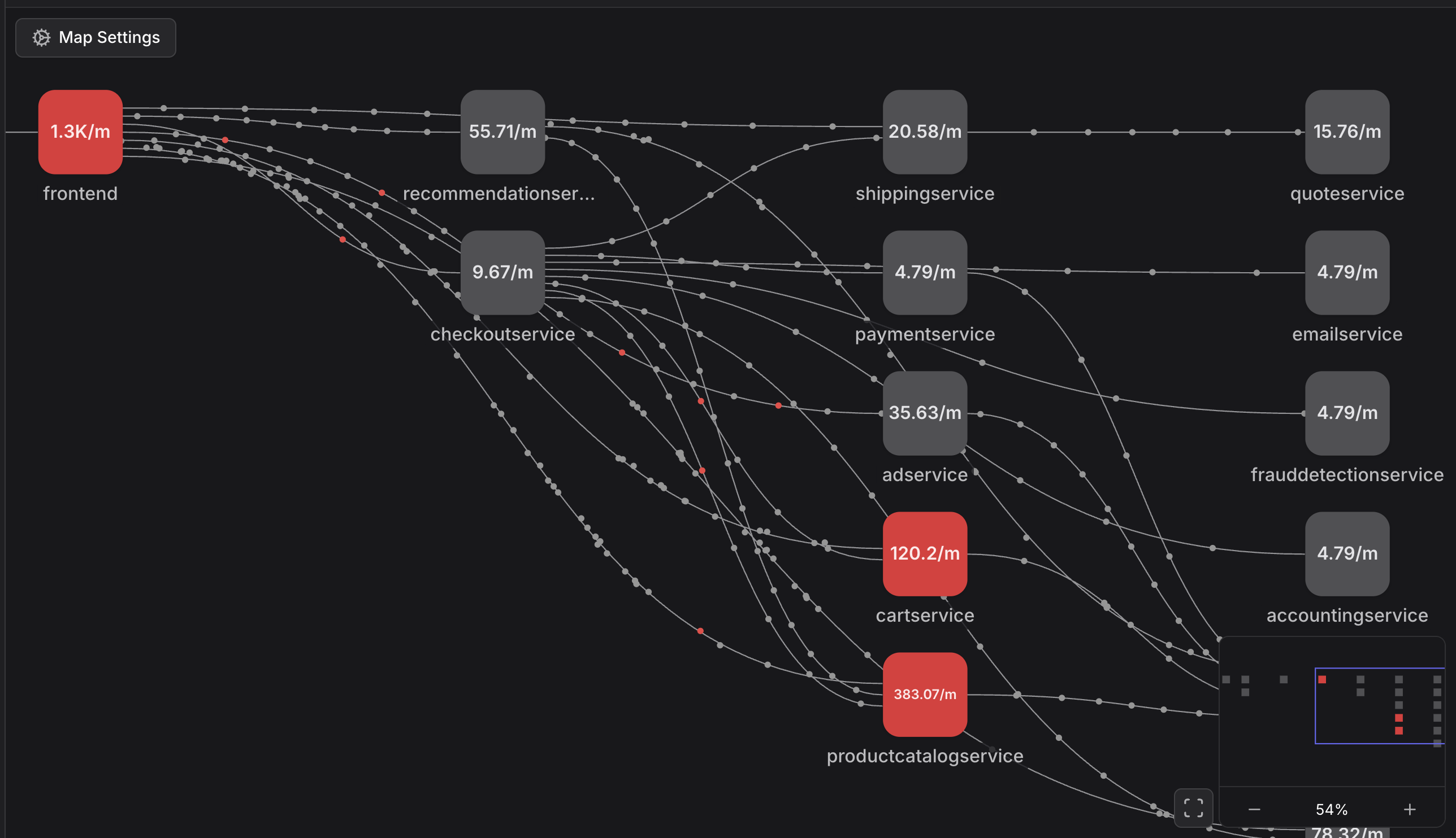
The Service Map visualizes your environment as a graph of interconnected nodes. Each node represents a service or an external resource, and the connections between them represent the flow of requests.
- Nodes - Represent services, or external services (e.g., frontend, productcatalogservice, google.com).
- Connections - Represent the traffic between services. The direction of the flow indicates the caller-callee relationship.
- Health Indicators - Nodes are color-coded based on their current health status.
Navigating the Map
You can access the Service Map by navigating to Services > Map in the primary navigation sidebar.
Map Settings
Customize your view using the Map Settings panel to focus on the data most relevant to your investigation:
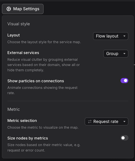
- Layout - Choose between a Flow layout (hierarchical view showing traffic from left to right) or a Force directed layout (organic grouping of related services).
- External services - Group or ungroup external dependencies (like third-party APIs or cloud services) to reduce visual clutter. Or hide them all completely.
- Show particles on connections - Enable animated particles to visualize the volume of request rates between services.
- Metric Selection - Choose which metric to visualize on the nodes. You can select various different metrics for requests, errors or durations.
- Size nodes by metrics - When enabled, the physical size of the node scales based on its request volume or error count.
Filtering and Searching
Use the search bar at the top of the map to filter for specific services. You can create complex filters using attributes like service.name to isolate specific sub-systems or microservice clusters.
Service Details and Drill-down
Clicking on any node in the map opens the Service Details sidebar. This panel provides a deep dive into the telemetry of the selected service without leaving the map context.
Summary and Infrastructure
The sidebar displays the service's resource attributes, such as runtime environment, Kubernetes deployment details (Namespace, ReplicaSet), and Cloud provider information (AWS Account, Region, Availability Zone).
Health and RED Metrics
- Failed checks - View recent alerts or synthetic check failures affecting the service.
- RED Metrics - High-level charts showing Request total, Error percentage, and Duration average to provide context needed for quick troubleshooting.
Operations and Resources
- Operations - A breakdown of the service's operations. For example, specific RPC or HTTP methods (e.g.,
GetProduct,ListProducts), with their individual request counts, error rates, and average durations. - Resources - Shows the health and performance of the underlying infrastructure, such as specific Kubernetes pods.
Investigate with Agent0
Agent0 is available directly within the Service Map to help you investigate issues, understand service relationships, and create dashboards or alerts based on the current view.
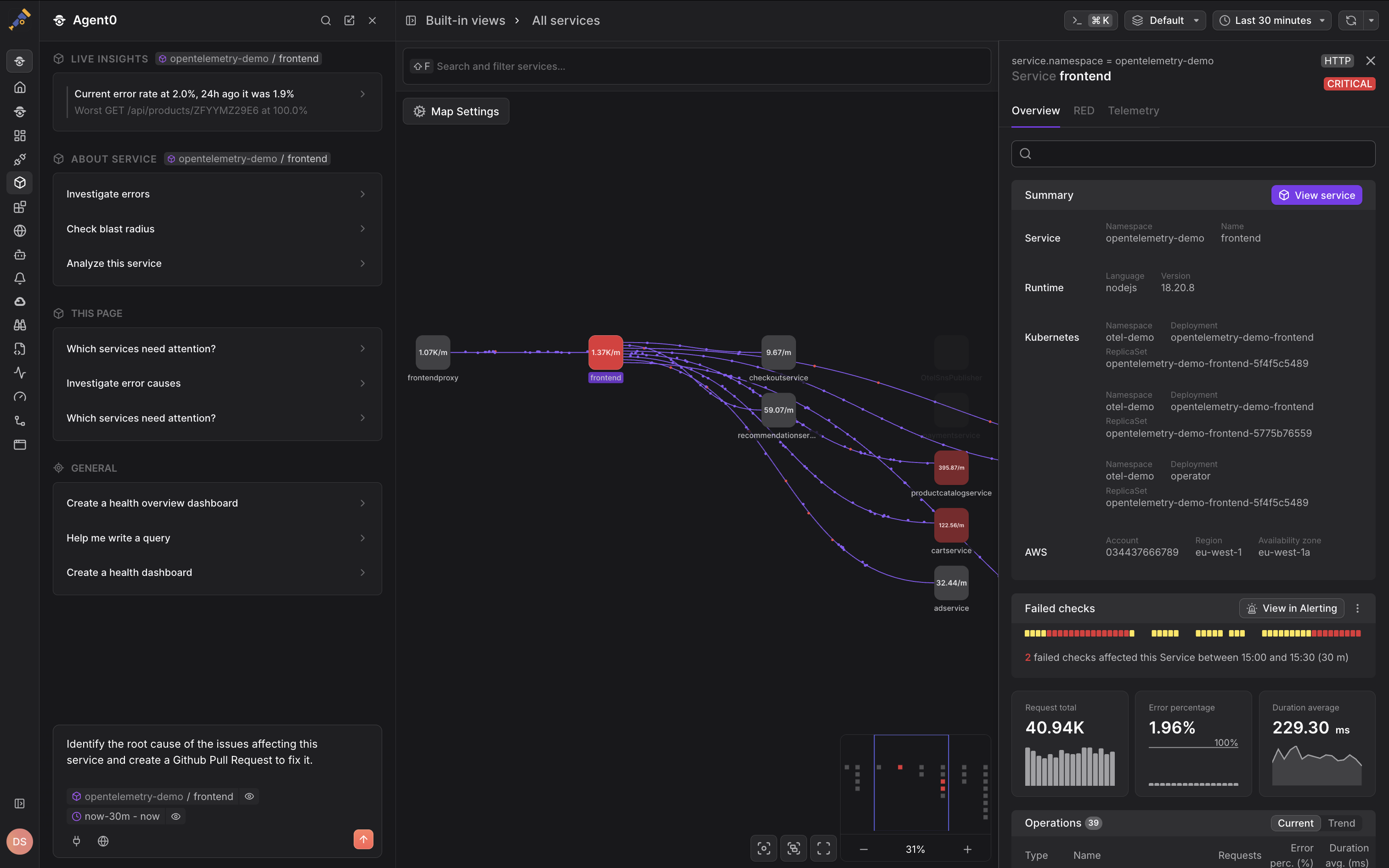
Click the Ask Agent0 button in the top-left corner to open Agent0, which understands the current map state and can:
- Answer questions about service dependencies and traffic patterns.
- Investigate anomalies in specific services or connections.
- Generate dashboards monitoring the services you're viewing.
- Create check rules for services showing degraded health.
- Explain the relationships between services in your architecture.
Agent0's responses are grounded in your actual telemetry and the current map context, making it faster to move from observation to action.
Saved Views
Dash0 allows you to save specific map configurations for quick access:
- Built-in views - Default views provided by Dash0.
- Your views - Custom-filtered maps that you have saved. To save a view, apply your desired filters and settings, then click Save as at the top of the screen. This is ideal for creating dedicated dashboards for specific applications.
Hover over a connection between two services to see the specific metrics for that edge, including the exact request rate and error percentage between those two specific components.