
A flame graph is a way to see, in a single picture, where a program spends its time or memory. It takes thousands of stack traces collected by a profiler, stacks them by call depth, and makes the width of each box proportional to how often that code path showed up. The widest boxes are your hot paths, and you can spot them in about two seconds instead of scrolling through pages of profiler text.
Brendan Gregg created the visualization in 2011
while debugging a MySQL CPU problem, and the name stuck because the layered,
warm-colored boxes look like flames. This article covers how to actually read
one, the single most common way people misread them, and the pitfalls that make a flame graph lie to you.
How to read a flame graph
Start with the anatomy, because every rule follows from it.
Each box is a stack frame, meaning a single function in a call stack. The
y-axis is stack depth. The bottom frame is the entry point (something like
main), and each frame above it is a function that the frame below it called.
So you read a single tower from the bottom up as a call chain: main calls
handleRequest, which calls parseJSON, which calls allocate.
The top edge of any tower is what was actually running when the profiler took its sample. That is the leaf, the function that was on-CPU (or allocating, or blocked) at that instant. Everything underneath it is ancestry, the callers that led there.
The width is the part that matters most. The wider a box, the more samples contained that frame, which means the more of your resource that code path consumed. A function that shows up in 40% of CPU samples is using roughly 40% of your CPU time. A wide box near the top is a hot leaf function doing expensive work directly. A wide tower that stays wide all the way up is an expensive call path where the cost is spread across the chain.
Here is the mental model in practice. You get paged for high CPU on a service,
pull up its CPU flame graph, and immediately see one box near the top spanning a
third of the width. You hover over it and it is a regex being compiled inside a
request handler. It is wide because it ran on nearly every request. That single
glance told you what a wall of perf report output would have taken twenty
minutes to surface.
The x-axis is not time
This is the thing that trips up almost everyone, and most explainers get it wrong or skip it entirely.
In a classic profiling flame graph, the horizontal axis does not represent the passage of time. The frames are sorted alphabetically, left to right. The only reason for that ordering is to place identical frames next to each other so they can be merged into one wide box, which is what makes the big picture readable.
The practical consequence: a box being to the left of another box means nothing. The one on the left did not run first. If you try to read a profiling flame graph left to right like a timeline, you will invent a story that isn't there. Width is the only horizontal quantity that carries meaning, and it is a count, not a duration.
Flame graph vs flame chart vs the trace flame graph
The word "flame graph" now gets attached to three related but distinct things, and knowing which one you're looking at changes how you read it.
The flame graph in Gregg's original sense is what's described above: aggregated stack samples, x-axis sorted alphabetically for merging, width equals sample frequency. This is what your CPU or memory profiler produces.
A flame chart looks almost identical but the x-axis is time. Chrome DevTools popularized this for single-threaded JavaScript, where you want to see the actual sequence of calls and any loops over time. Because it preserves temporal order, a flame chart can't merge repeated frames, and it can't sensibly show more than one thread at once.
The trace flame graph you see in distributed tracing tools, including the one in Dash0's trace view, is technically closer to a flame chart: the x-axis is absolute time in milliseconds, the root span sits at the top, and child spans stack below it by call depth. Each block is a span, its width is its duration, and spans from the same service share a color. This is the most useful view for "where did this 800ms request actually spend its time across services," even though, by Gregg's strict definition, it's a flame chart wearing a flame graph's name. The industry settled on calling it a flame graph and it's not worth fighting.
Here is one in the Dash0 trace view. The whole request took 9 ms, shown by the
root span GET /api/recommendations running the full width at the top. Read it
top to bottom and you get the call chain: the frontend calls
RecommendationService.ListRecommendations, which runs get_product_list, which
checks a feature flag before returning. A second cluster of spans then handles
ProductCatalogService.GetProduct to fetch the details for the recommended
products.
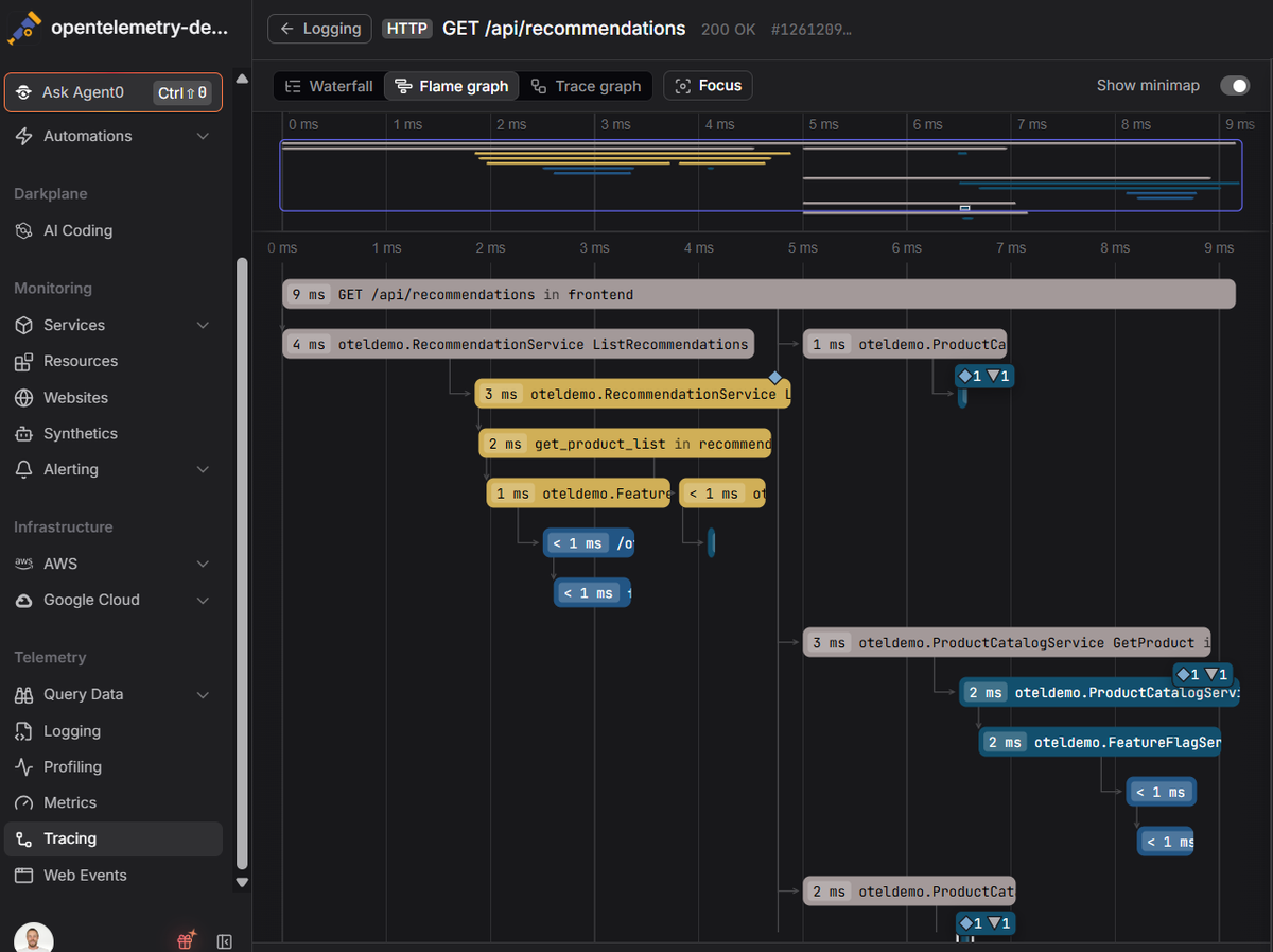 Two things this view makes clear. Color groups spans by service, so you can see at
a glance that the yellow work (RecommendationService) and the blue work
(ProductCatalogService) are two separate hops. And because the x-axis really is
time here, left-to-right order carries meaning: the recommendation logic wraps up
around the 4 ms mark before the catalog lookups begin near 5.5 ms. That is the
opposite of the profiling flame graph above, where horizontal position is only
alphabetical sorting. Same shape, different rules, which is exactly why you check
the axis before reading one.
Two things this view makes clear. Color groups spans by service, so you can see at
a glance that the yellow work (RecommendationService) and the blue work
(ProductCatalogService) are two separate hops. And because the x-axis really is
time here, left-to-right order carries meaning: the recommendation logic wraps up
around the 4 ms mark before the catalog lookups begin near 5.5 ms. That is the
opposite of the profiling flame graph above, where horizontal position is only
alphabetical sorting. Same shape, different rules, which is exactly why you check
the axis before reading one.
The takeaway is simple: before you interpret one, check whether the horizontal axis is frequency or time. If it's a code profile, it's frequency. If it's a distributed trace, it's time.
How flame graphs are generated
Profiling flame graphs come out of statistical sampling. A profiler interrupts the running program at a fixed rate, say 99 times per second, records the current call stack of each thread, and does this thousands of times. Stacks that represent hot paths show up in more samples, so the aggregate is a statistical picture of where resources went. Sampling occasionally instead of instrumenting every call is why the overhead stays low enough to run in production.
The classic toolchain on Linux is perf feeding Gregg's scripts. This captures
30 seconds of stacks across all CPUs and renders an SVG:
12perf record -F 99 -a -g -- sleep 30perf script | stackcollapse-perf.pl | flamegraph.pl > flame.svg
The middle step, stackcollapse, is what folds each stack into a single line of
semicolon;separated;frames count pairs, which is the format flamegraph.pl
turns into boxes.
The bigger shift is standardization. In March 2026 the OpenTelemetry Profiles signal entered public Alpha, making continuous profiling the fourth OpenTelemetry signal alongside traces, metrics, and logs. It builds on the pprof format, is collected by an eBPF profiler that runs as an OpenTelemetry Collector receiver, and crucially, each profile sample can carry the trace and span ID that was active when it was captured. That link is what lets you jump from a slow span straight to the flame graph of the code that made it slow.
Common pitfalls
A flame graph is only as honest as the data feeding it, and a few failure modes show up again and again.
Reading the x-axis as time. Covered above, but it's worth repeating because it's the number one mistake. On a profiling flame graph, left-to-right order is alphabetical noise. Only width means anything.
Chasing the single widest box. One function can appear in many different call paths, so its total cost is scattered across the graph instead of concentrated in one fat box. If you only optimize the widest box you see, you can miss a function that's death by a thousand cuts. Most tools let you invert the graph or search a function name to sum all its occurrences. Look at a function's total footprint, not just its biggest single appearance.
Broken or truncated stacks. To build a stack trace, the profiler has to
unwind the stack, and it usually relies on frame pointers to do so. Compilers
often omit frame pointers as an optimization, which produces flame graphs that
are suspiciously shallow, flat, or full of [unknown] frames. If a graph looks
too simple to be real, it probably is. Rebuild the target with
-fno-omit-frame-pointer, or tell the profiler to use DWARF unwinding with
perf record --call-graph=dwarf.
Confusing icicle layout for a bug. Many tools default to an inverted layout called an icicle graph, with the root at the top and stacks growing downward. It's the same data flipped, chosen so the root frame is always on screen without scrolling. Nothing is wrong, the y-axis just points the other way. Dash0's trace view uses the root-at-top layout for exactly this reason.
Final thoughts
A flame graph compresses a mountain of stack samples into a shape you can read at a glance, and once you internalize that width means frequency and the top edge is what was actually running, it becomes the fastest way to answer "why is this slow?" The catch is that a flame graph in isolation tells you where the CPU went but not which request triggered it. That's why correlation is the real prize: a profile sample carrying a trace ID lets you move from a latency spike to the exact line of code behind it.
Dash0 supports continuous profiling through the OpenTelemetry eBPF profiler, so profiles land on the same correlated timeline as your distributed traces, logs, and metrics, sharing the same resource context. When a span looks slow in the flame graph, the profile for that exact window is one click away, no context-switching into a separate tool.
Start a free trial to see your traces, metrics, logs, and profiles correlated in one place. No credit card required.