


Spans Table dashboard widget
The new Spans Table widget brings a sortable, self-refreshing table of spans to your dashboards and the query builder.
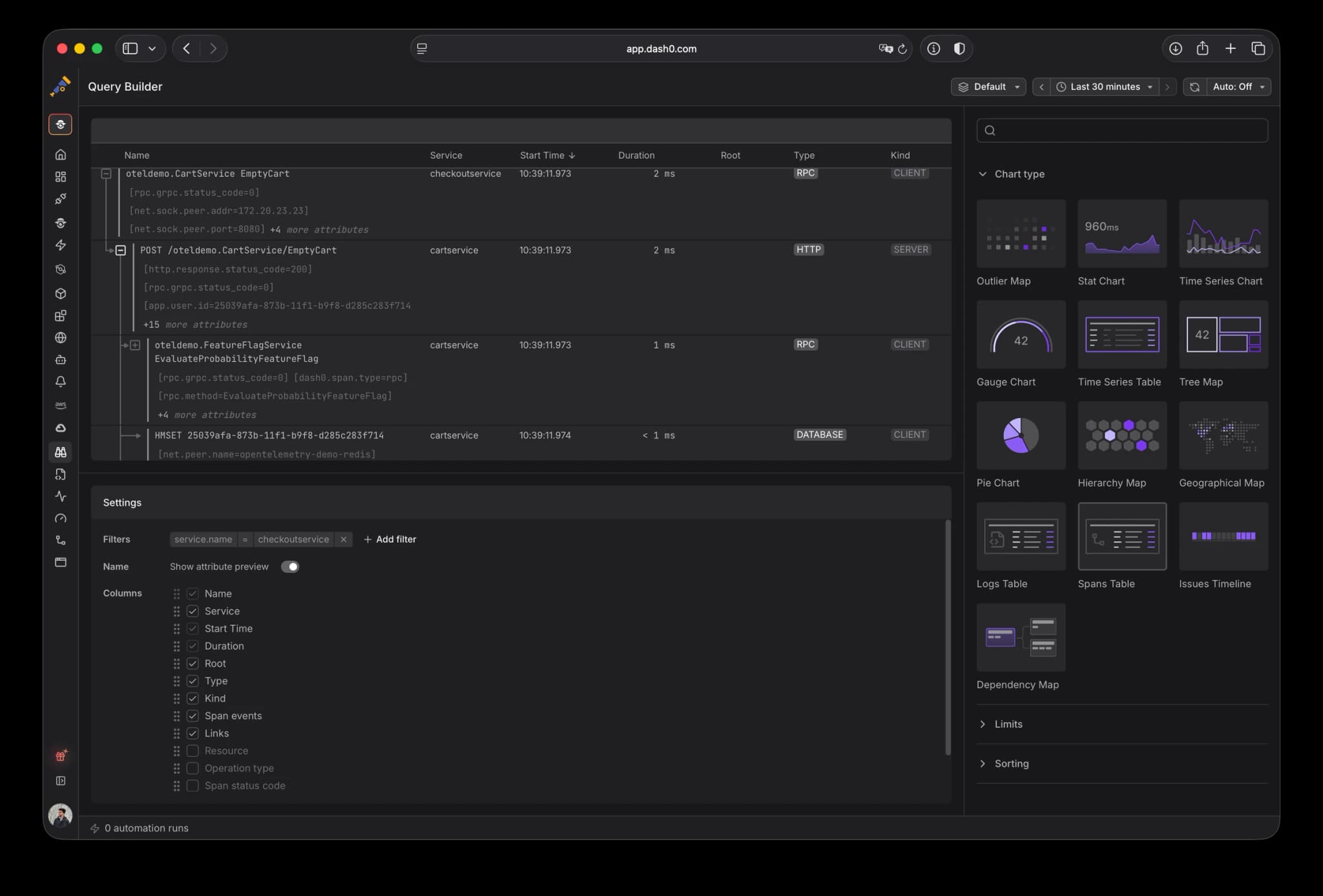
Your dashboards could already pin a live Logs Table, but spans had no equivalent. If you wanted to see raw spans next to your charts, say the slowest requests to an endpoint or every span carrying an error, you had to break away from the dashboard and jump over to the Trace Explorer.
Now you can add a Spans Table widget to any dashboard. It fetches spans on its own and shows them in a sortable table. Sort by start time, duration, or status code, pick exactly the columns you want (name, service, duration, span kind, status, and more), add any attribute as its own column, and scope the whole table with filters and dashboard variables.
Every row links straight into the Trace Explorer and carries your columns and filters with it, so a single click takes you from the dashboard to the full trace and span detail with nothing to set up again.
The result is a dashboard that can show live spans right beside your metrics and logs, so the traces that matter stay in view instead of a tab away.